Overview
Background
As a regular Spotify user, I wasn’t entirely satisfied with how I could organize my music into playlists. I’m a visual person and I always saw songs as having multiple attributes. My experience as a musician and former music business professional has shaped how I think and talk about music, particularly when articulating what I appreciate about a song and discovering new music. The typical music listener does not possess this same capacity for describing musical elements and qualities. I knew if I could come up with a solution that taught people how to describe music on this level, they would be able to make playlists that are as cohesive and precise as those that I and other musicians could.
Problem
Casual music listeners are overwhelmed making playlists they want to listen to because it is time-consuming and confusing to figure out songs that will work together from the abundance of music accessible to them.
Solution
An app that lets users seamlessly create high-quality playlists with confidence that are perfect soundtracks to their moods and activities.
Methods
User interviews, empathy maps, affinity diagrams, user personas, user journey maps, user flows, wireframing, prototyping
Tools
Figma, Adobe Illustrator, Miro
Role
UX Designer (Research, Visual Design, Interaction Design)
Team
Self-directed, with feedback from mentor and peers
Research
To gain a deeper understanding of the situation, I conducted secondary and primary research, including market research and semi-structured user interviews. I made a research plan containing my objectives and research questions as a roadmap to keep me on track.
Research Goal
To understand the ways people interact with music and playlists, as well as uncover opportunities to improve the playlisting experience.
Research Objectives
1. Understand the end-to-end experience of how and why users discover music, create and share playlists.
2. Discover the different tools people use when interacting with playlists and how they feel about each tool.
3. Learn about the pain points users encounter during their playlist creation experience and what improvements they might make.
Secondary Research
Market Research
I conducted market research to understand the current state of music streaming, music discovery, music sharing, and playlist creation.
Insights
• Audience trust affects the trustworthiness of a playlist's creator, and true music discovery comes from recommendations made by real people.
• Spotify-curated playlists are increasingly used by record labels as a marketing tool to help promote their artists while playlists created by real users are hard to find due to Spotify's lack of efforts to support independent playlist curators on their platform.
• Playlists aid in sorting through the plethora of listening options that streaming services provide.
• Strong playlists use context to establish emotional and social connections with the music, whereas this context is lost in algorithmic music suggestions.
• Music recommendations must be tailored to the user, delivering both enough similarity and diversity to broaden the listener's musical preferences.
• While playlists can be customized in the same way as physical mixtapes, they don't offer the same level of engagement that fosters the development of music preferences.
Primary Research
User Interviews
I broke down my research goal into three objectives and formulated five interview questions for each objective to ensure I stayed on track and had enough information to solve my research goal. I created an interview guide based on my objectives and included follow-up questions for each major question to ensure I asked enough follow-up questions to obtain the most insights possible.
I conducted semi-structured user interviews with four participants (2 female, 2 male) between the ages of 21-25. I transcribed and coded the interviews for significant quotes, key themes, and other important insights.
Insights
All participants:
• Use Spotify on their phone as their primary way to listen to music
• Listen to music most often when driving/commuting
• Said mood has the greatest impact on how they listen to music
• Build playlists based on moods, context, and purpose and include songs based on specific musical elements or qualities
• Browse and search Spotify to find new songs
• Said variety is important to discovery and playlist creation
75% of participants:
• Find activities more enjoyable and are motivated to finish tasks when they are listening to music
• Want to make more high-quality playlists that can be updated on a regular basis
• Are reluctant to share their playlists because they don't think they're good
• Expressed dissatisfaction with Spotify recommendations and a desire for more diverse and personalized recommendations
• Feel more connected to others when they talk about music and receive new music recommendations
• Said Spotify's UI makes managing their music library more difficult
Research Synthesis
Empathy Maps & Affinity Diagrams
I created empathy maps for each participant using these transcripts to better understand my users. To find themes from my interviews, I created an affinity diagram, which I then used to create my user personas.
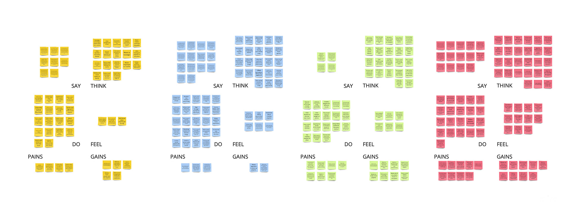
Empathy maps for interview participants

Affinity diagram organizing individual empathy maps into themes
User Personas
I developed two user personas based on my interview findings. The Casual Music Listener represents the majority of my users while the Music Fanatic represents a minority of users. The Music Fanatic persona helped inform my goals for the type of solution I needed to design because solving the pain points for one persona would also solve the pain points for the other.
Pain Points
• Music recommendations are obvious, way off from what they want, or lack variety.
• Lack of playlist and music library organization makes it challenging to group songs into playlists.
• Large playlists become overwhelming to listen to and update.
• Discovering new music is effortless but filtering and organizing new finds is overwhelming.
Needs/Priorities
• Ease, convenience, and control over their sharing and playlist creation.
• Highly personalized and accurate music recommendations.
• Create high-quality, cohesive playlists that make their days more enjoyable.
User Journey Map
I created a user journey map based on the experience of the Casual Music Listener to better understand where pain points occurred when creating playlists. I chose to focus my design decisions on the Casual Music Listener because my interview findings were most aligned with that persona.
From my user journey, I identified problems occur when users:
• Have not kept their music libraries up to date and organized after discovering new music
• Are unsure whether the songs they add to a playlist will work together
Define
POV Statements
To define the problem I was attempting to solve, I combined my research insights and user needs into Point-of-View (POV) Statements. For each POV statement, I created a How-Might-We (HMW) question to help me organize my problem statements into a structured brainstorm.
Before brainstorming, I knew my design solution would need to let users effortlessly create high-quality playlists that are perfect soundtracks to their moods and activities through:
• Showing them what songs will be consistent with their desired vibe
• Improved discovery features to keep their playlists fresh with highly-personalized recommendations
• Organization features (ie. tags) so they can quickly find songs for their playlists
Ideate
How-Might-We Questions
From my ideation session, I decided on the following ideas I wanted to implement in my designs:
• Swipe through song recommendations
• "Wish list" of songs to listen to
• Create custom tags for songs
• Feedback while making playlists with a visual bar showing how close they are to making a cohesive playlist
• Community playlist created by users
• DM feature to share music in-app with friends
• Mixtapes with voice messages or text explaining the purpose of the playlist and song choices
User Flow
I divided the user journey into the various steps users take to create a playlist. I also identified and combined other major tasks that users complete during the playlist creation process into a user flow. This allowed me to see where I could simplify steps as I refined the flow and identified key screens and features to focus on during the design stage.
Prototype
Paper Wireframes
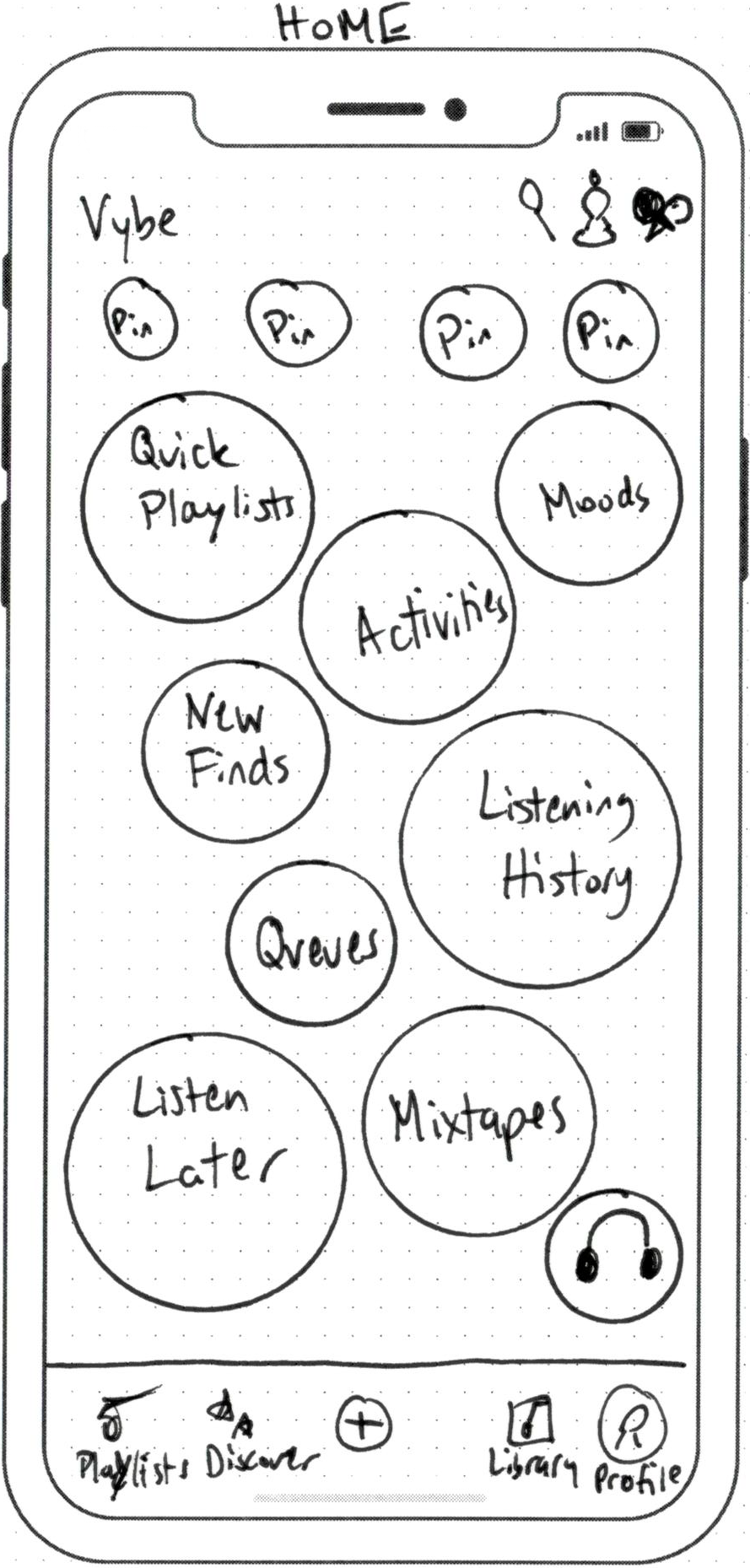
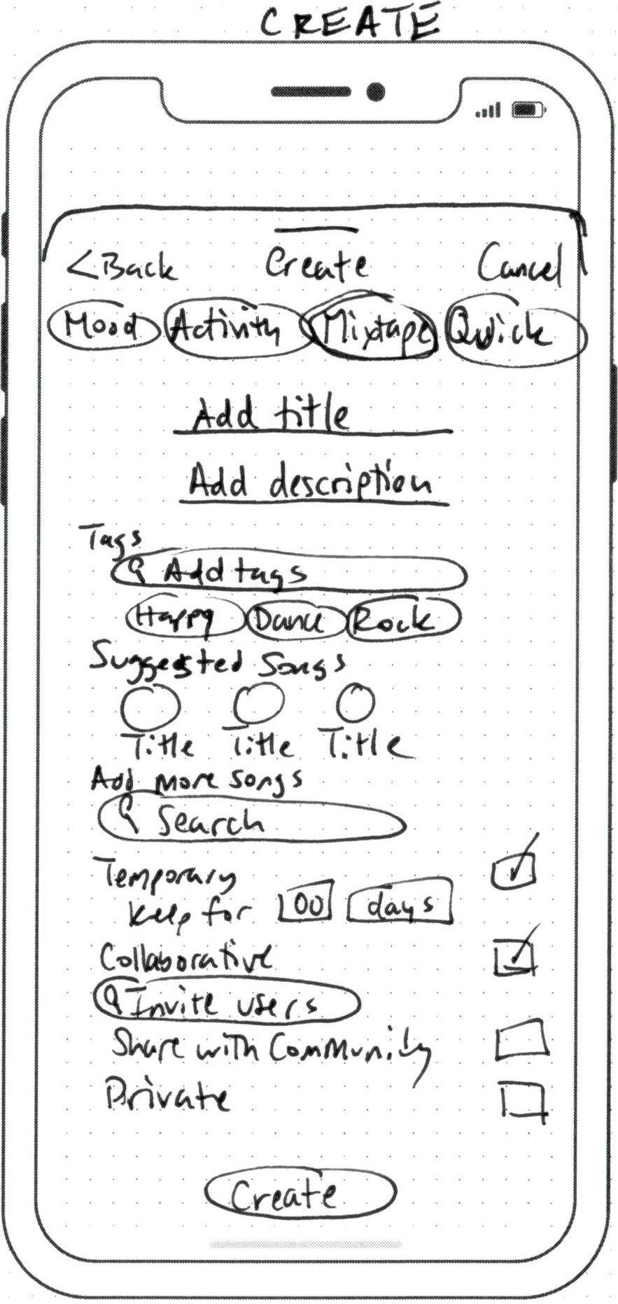
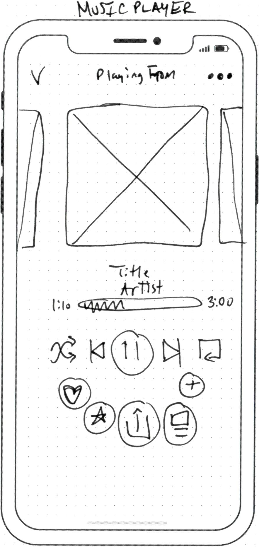
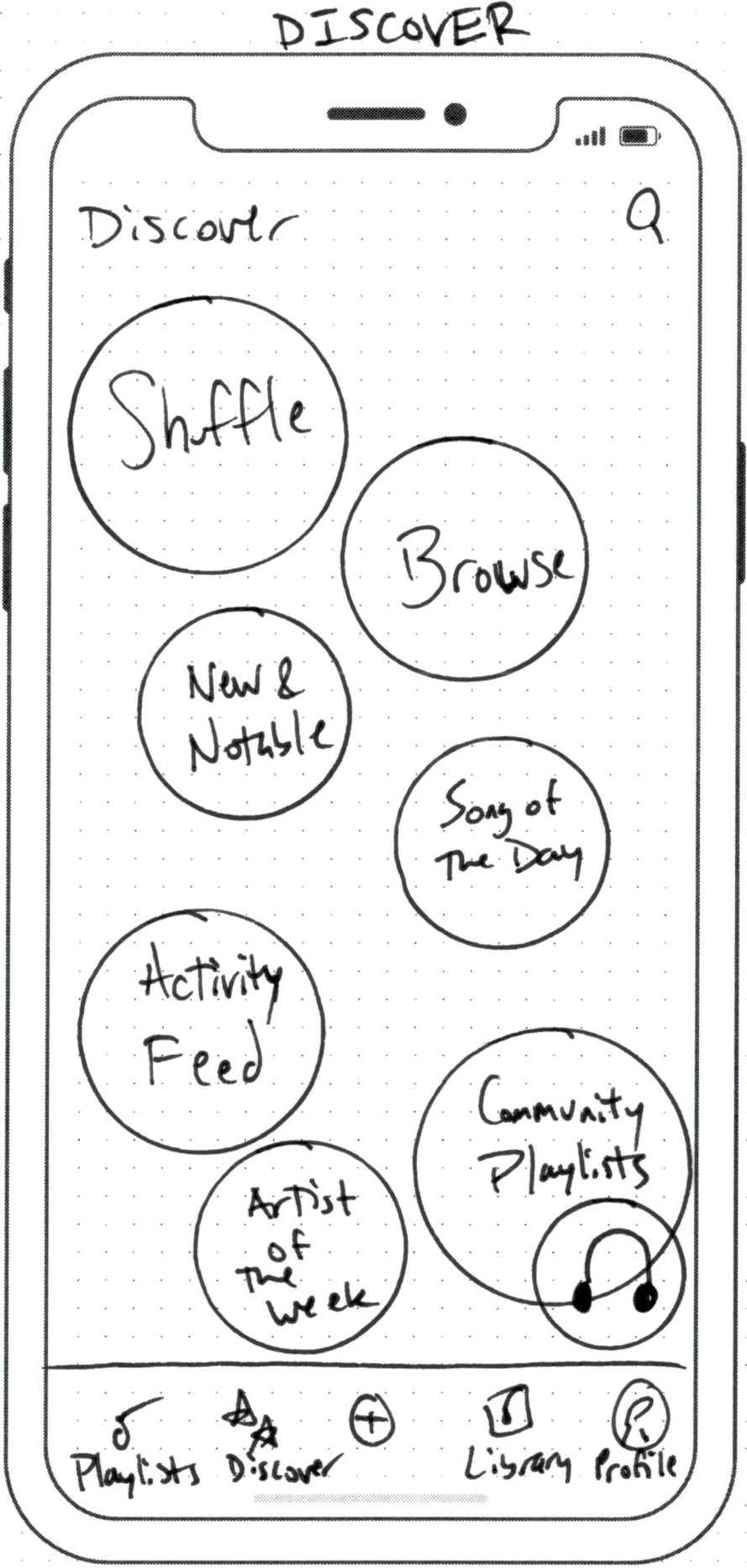
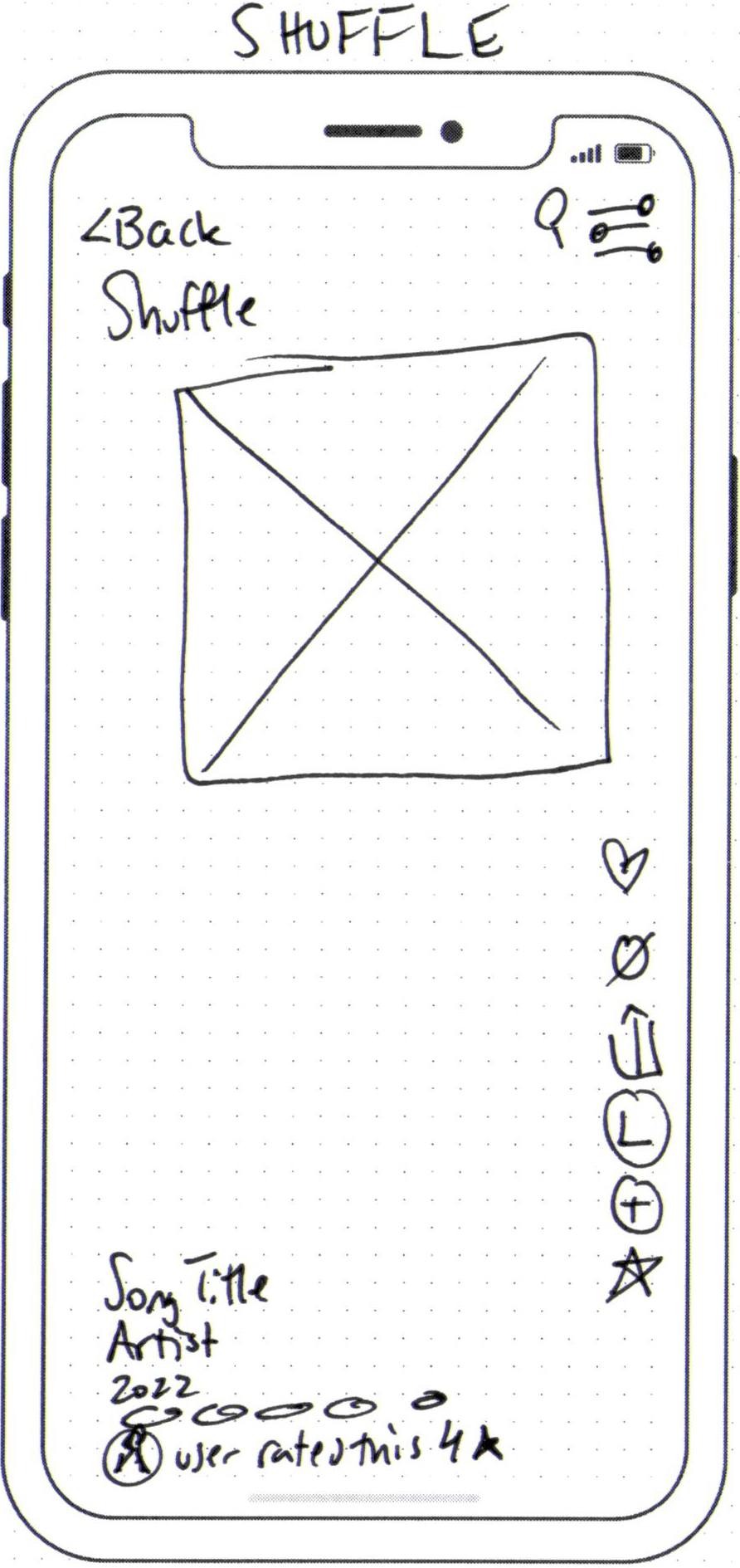
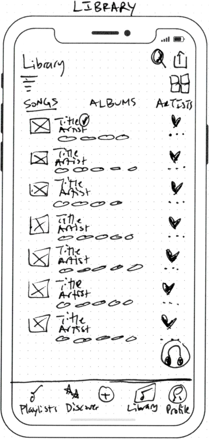
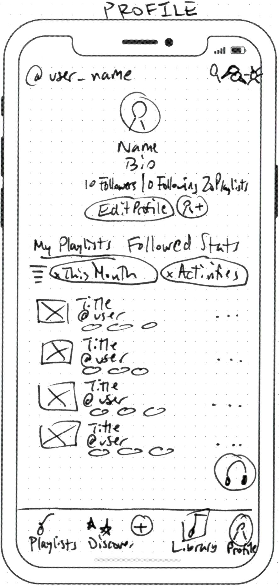
Based on my user flow and ideating session, I created a list of the major screens I would need to help me design my general layout. After determining the specifics of each screen's requirements, I began sketching low-fidelity wireframes. This assisted me in determining the components I would need to create when developing my design system, as well as in polishing my layout prior to digitizing my wireframes.
Low-Fidelity Digital Wireframes
My paper wireframes went through several iterations once I started building them in Figma. The Home and Discover screens went through the most iterations as I tried to declutter and refine what was most important for users to have easy access to while also reducing the number of steps users needed to take to complete primary tasks.
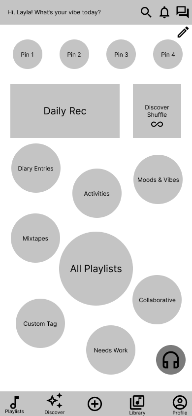
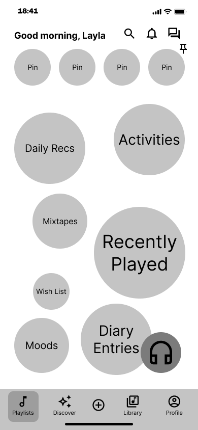
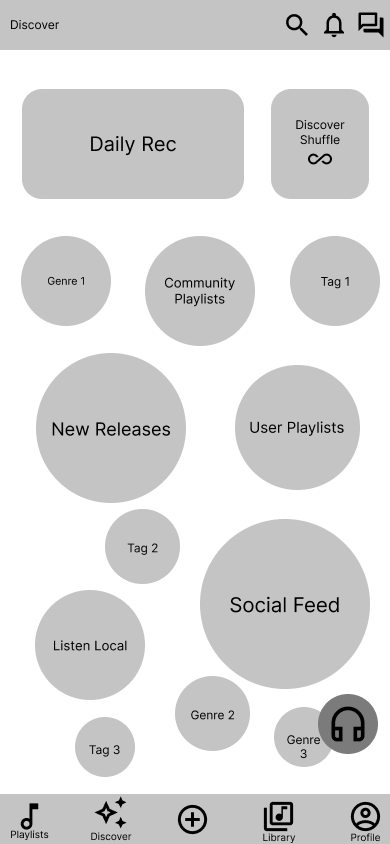
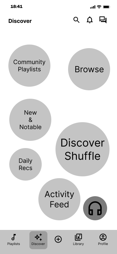
My research indicated that users were frustrated with their Home screen being cluttered with irrelevant recommendations and other items. When finalizing the Home screen layout, I chose to include only playlists, user listening history, and users' pinned playlists for quick access to the things that are most important to them.
I initially intended to keep the bubble layout consistent across all screens, but I quickly realized this would make navigation less efficient and more time-consuming. Users would not have the same easy access to discover features that they do to playlists. Instead, I designed the Discover screen with tab navigation so users could quickly switch between different types of content to discover new music. I also decided to have featured content at the top of each screen to better organize the content.
Final Designs
Home & Playlist Bubbles
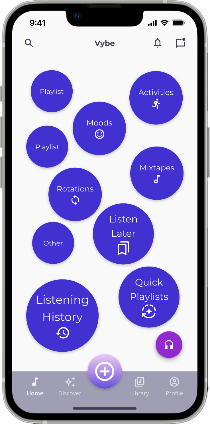
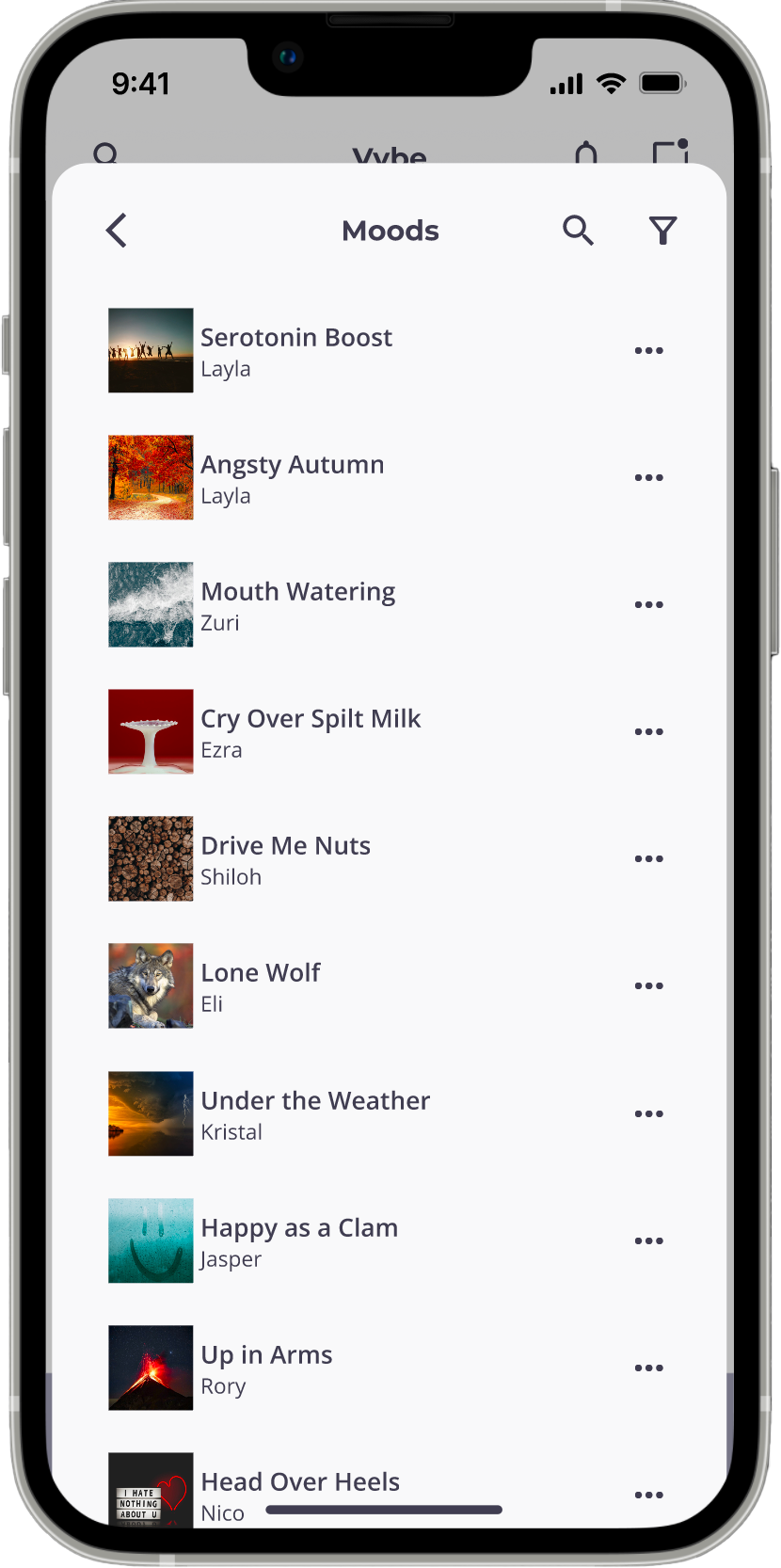
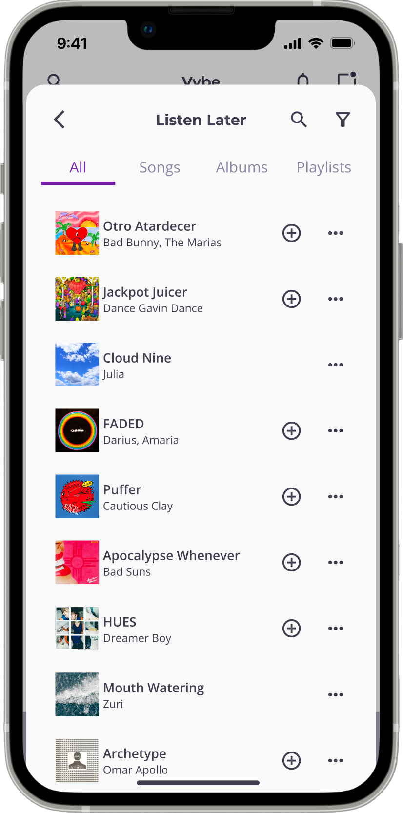
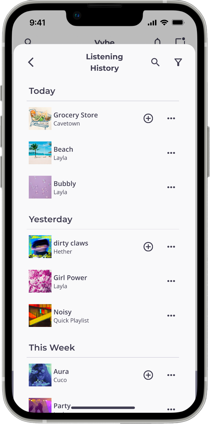
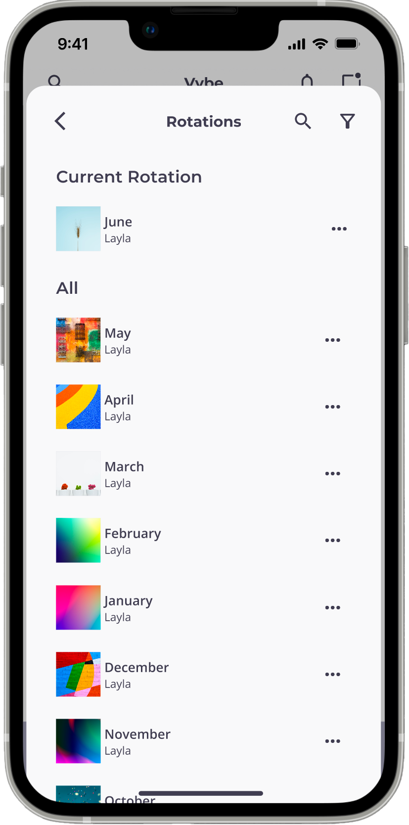
The categories assigned when creating or editing are used to organize user playlists on the Home screen. Unless otherwise specified, playlists are stored in the "Other" category by default. Assigning a playlist to "None", "Mood", or "Activity" will generate a playlist in the manner users are accustomed to seeing on other music streaming apps. When a user creates a "Mixtape", they can include audio messages and liner notes to provide context for why they chose a song for the playlist. "Quick Playlists" are playlists that are created automatically based on the tags users select when creating the playlist. Users can make a "Rotation", which is a playlist of songs they want to listen to the most. Users can save songs, albums, and playlists to their Listen Later without having to search for them.
Creating Playlists
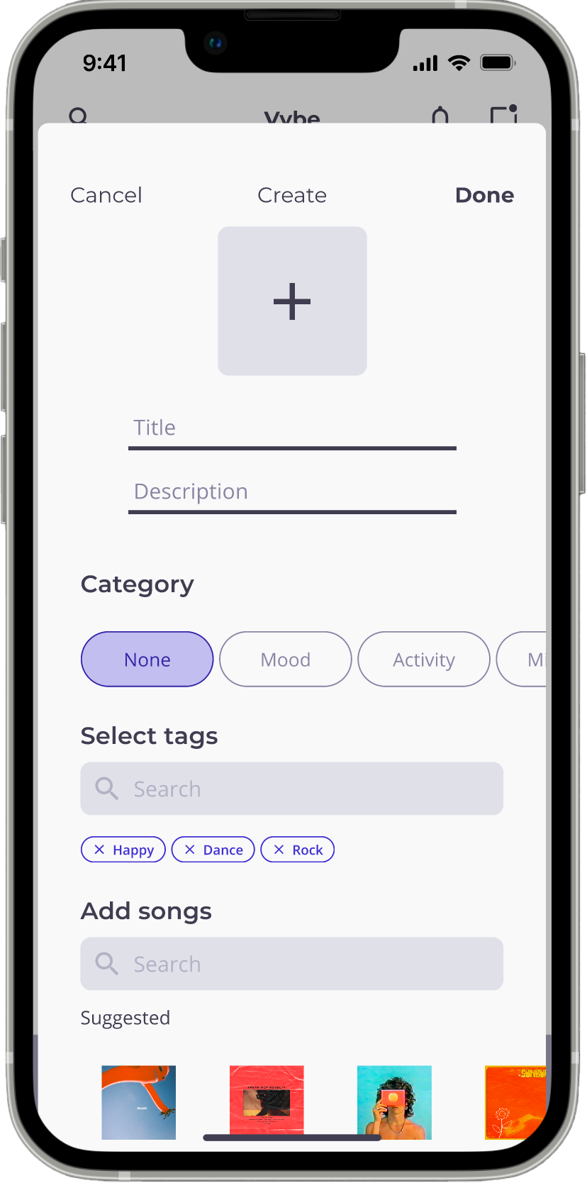
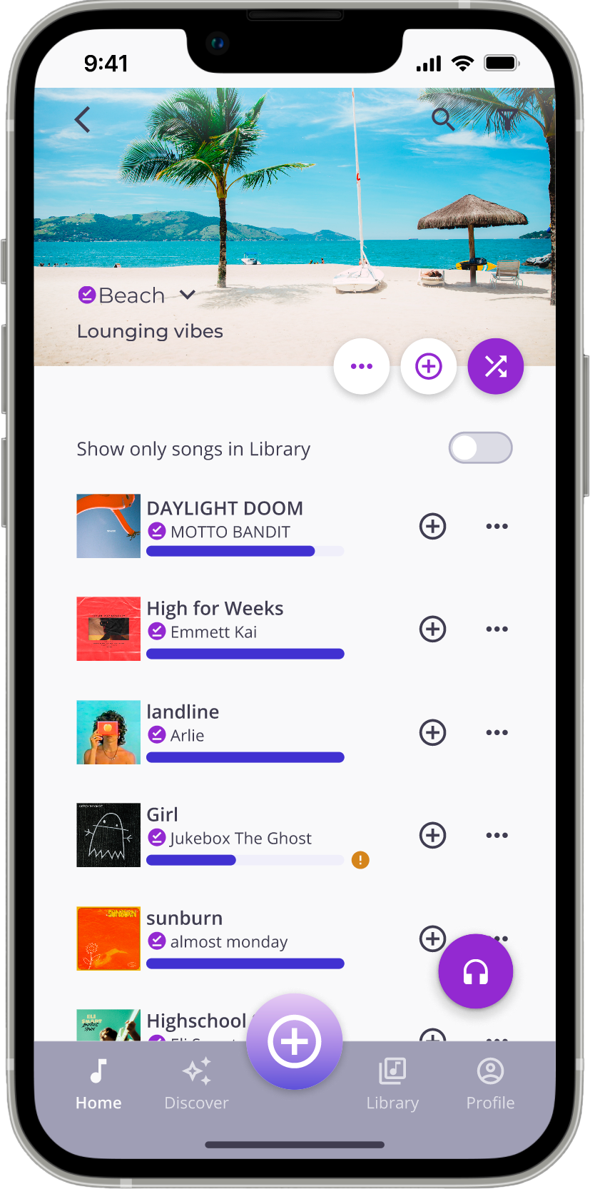
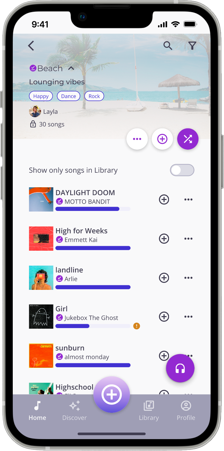
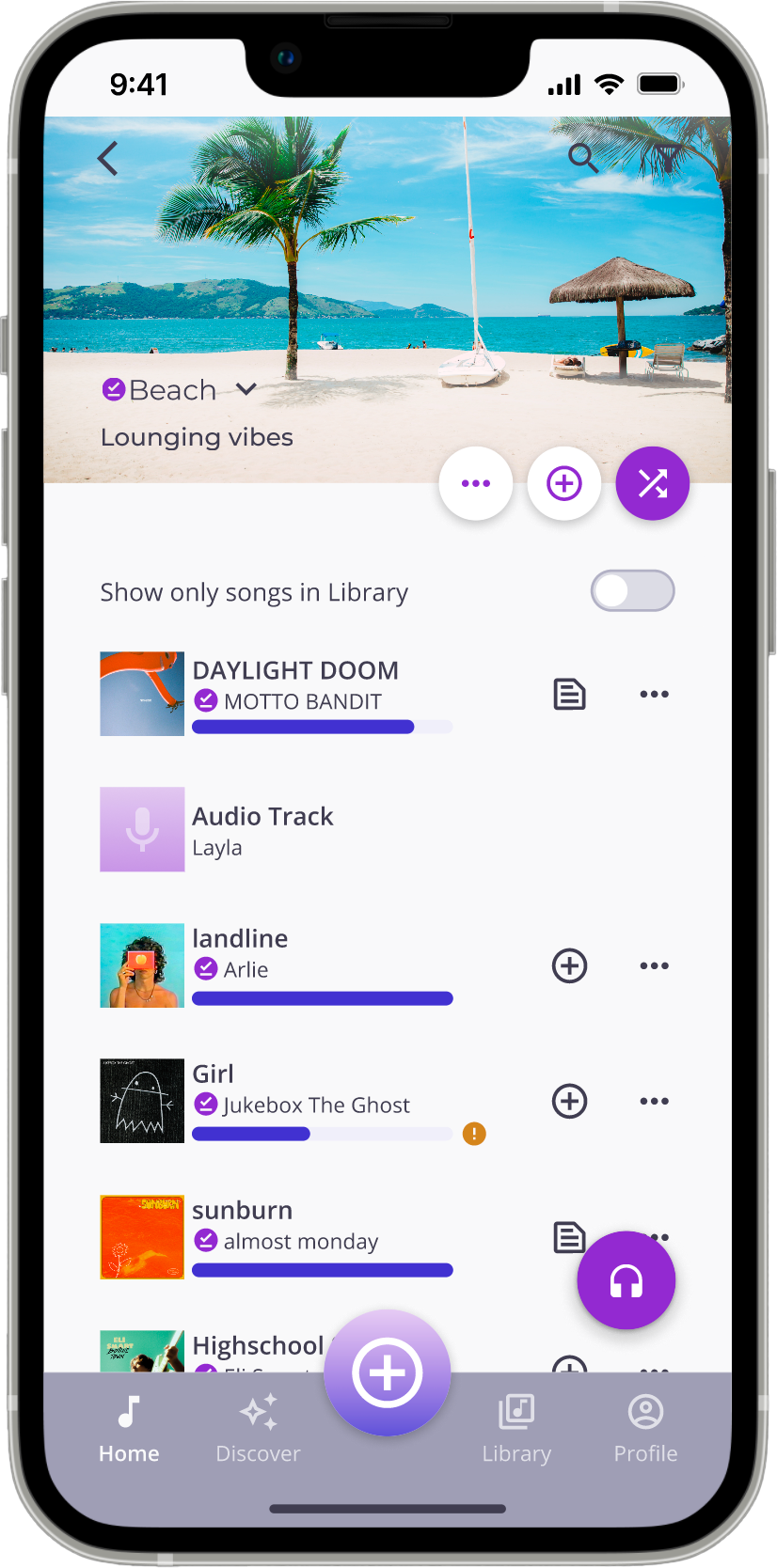
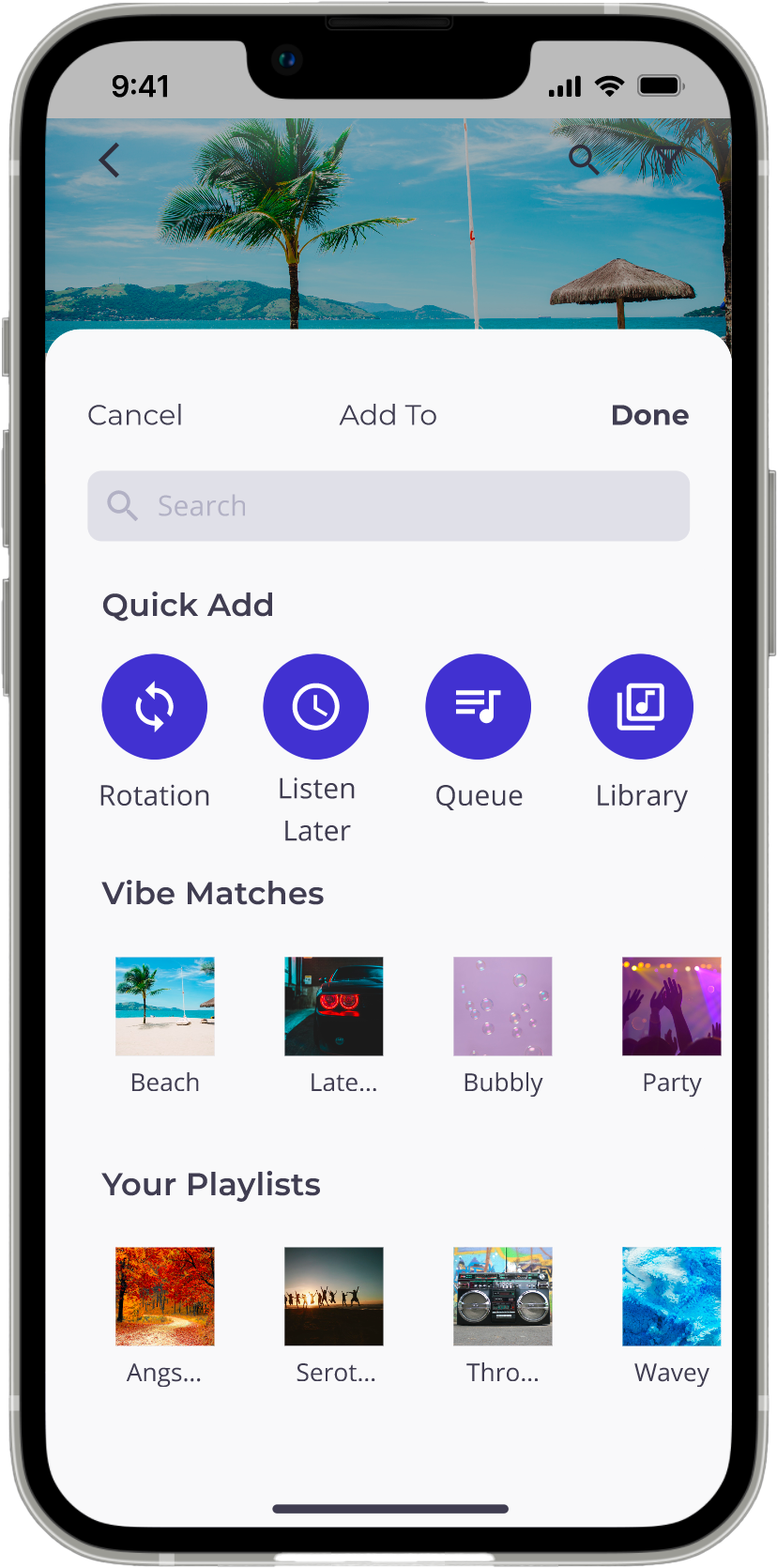
Users can create playlists by tapping the plus sign icon in the center of the bottom navigation bar to open the Create modal. Users choose the category of playlist they want to create to help them organize their playlists on the Home screen and tags that correspond with the vibe they want the playlist to have. Suggested songs to add will appear based on the tags selected, and users will be able to continue adding songs before finalizing. Before submitting and accessing their newly created playlist, users can make final adjustments to their playlist settings.
Other key playlist features:
• Each song has a vibe bar that shows how closely its vibe fits the playlist's desired vibe based on how many of the song's tags match the playlist's. If a song has two or fewer relevant tags, an alert will appear next to it to let users know it might not be the ideal choice for the playlist.
• Users can set a playlist to temporary, which will delete the playlist after the specified time period. This allows users to automate cleaning out their playlist library with playlists they create for one-time use and avoid cluttering their library with outdated playlists.
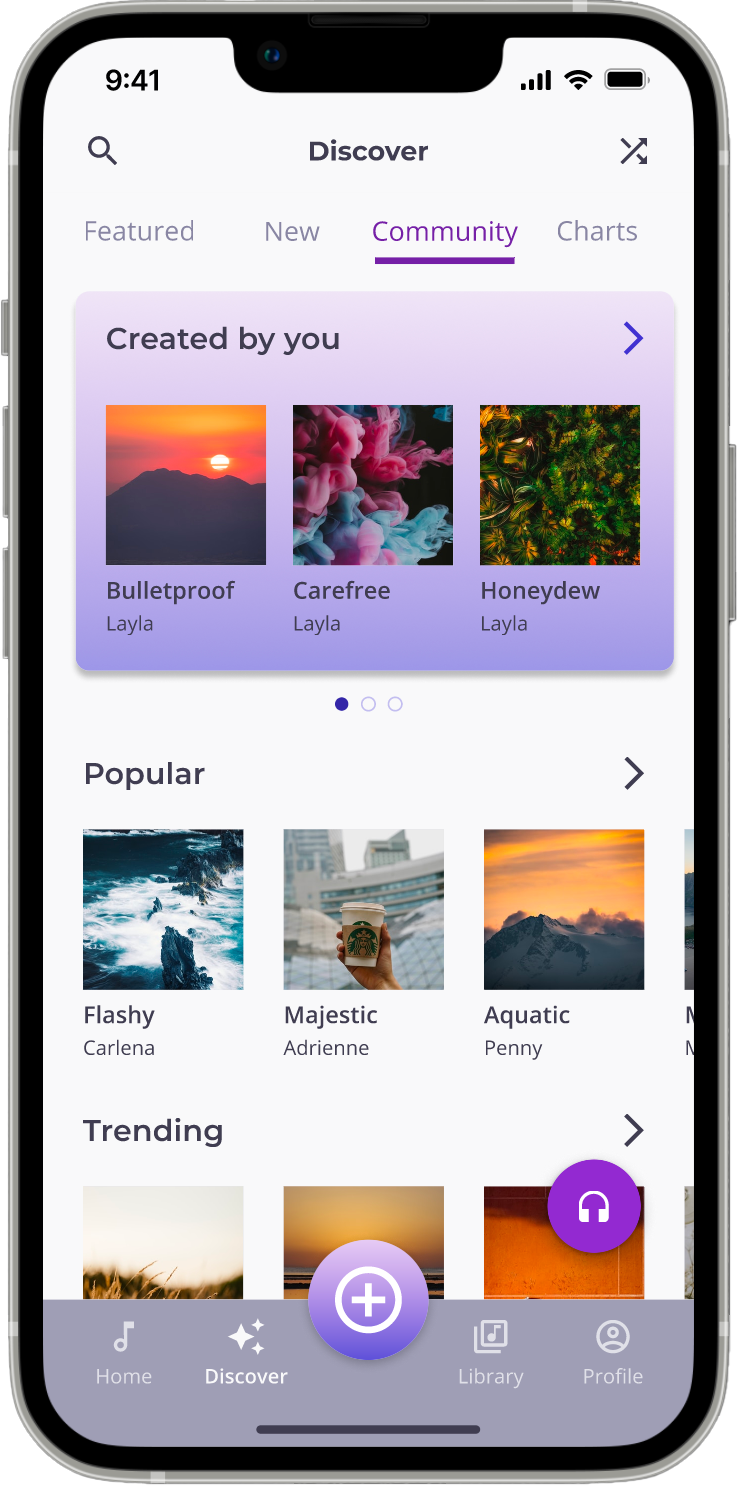
• Any app user can add songs to a playlist that has been shared with the Community as long as their choices are in line with the playlist's tags. Community playlists are a human-curated alternative to algorithm-curated playlists. It also allows users to see what other people with similar music tastes are listening to and to view their playlists.
• The plus sign icon next to songs in a playlist opens the "Add To" modal, which allows users to quickly add a song from one playlist to another. The top row is for more immediate adds, like the queue or their Current Rotation. The second row displays a list of playlists you've created that the song would sound best on.
• Users who want to hear songs they are familiar with from another user's playlist can choose to only see songs in a playlist that are saved in their library.
Discover Features
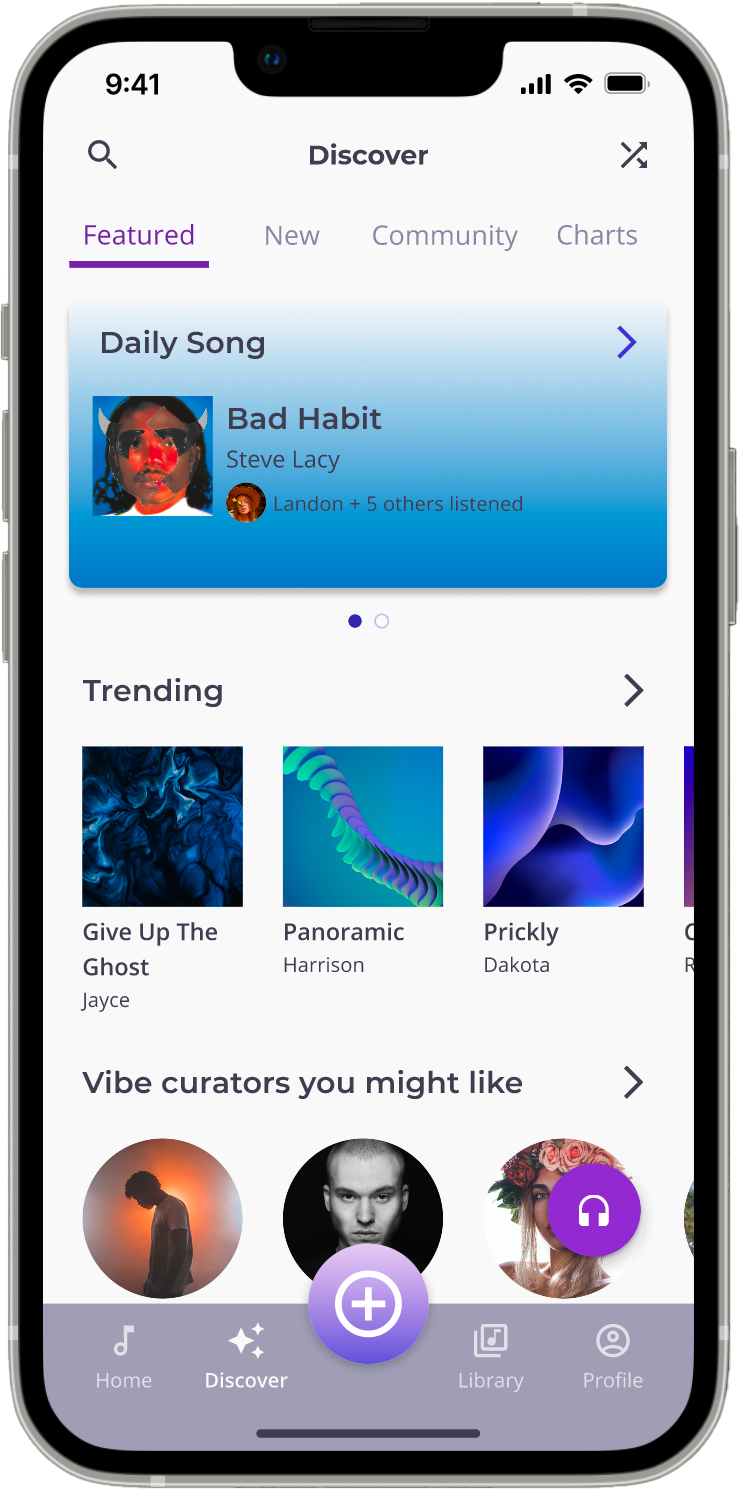
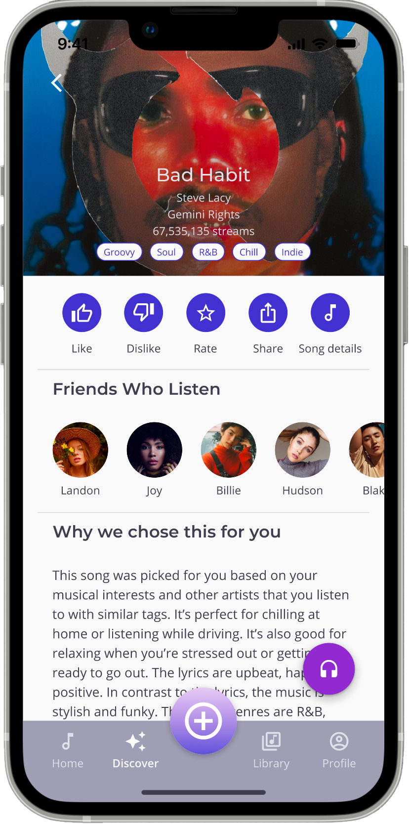
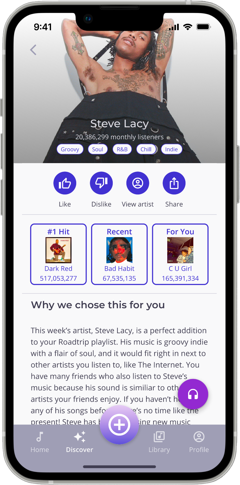
Users are immediately provided with updated personalized music recommendations in the Featured section of their Discover screen, including a Daily Song and Weekly Artist. Both recommendations include an explanation of why the song and artist were chosen to teach users more about how to express their musical preferences. Users can dislike a recommendation if they don't like it, and the app will adjust future recommendations.
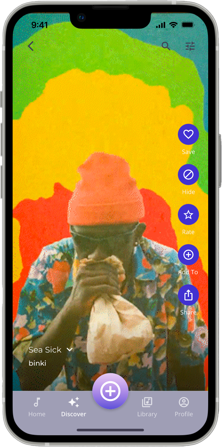
Users can also discover songs by scrolling through song previews in the top navigation and tapping the shuffle icon. This opens an infinite scroll of visualizer backgrounds from which users can quickly hear a snippet of the song and decide whether or not to save it to a playlist. Users can adjust the shuffle settings in the top navigation to only play songs with specific tags, songs by similar artists or songs, or by more specific criteria like tempo, key, etc. This feature enables users to easily find new music tailored to their preferences and quickly add it to their playlists.
Library
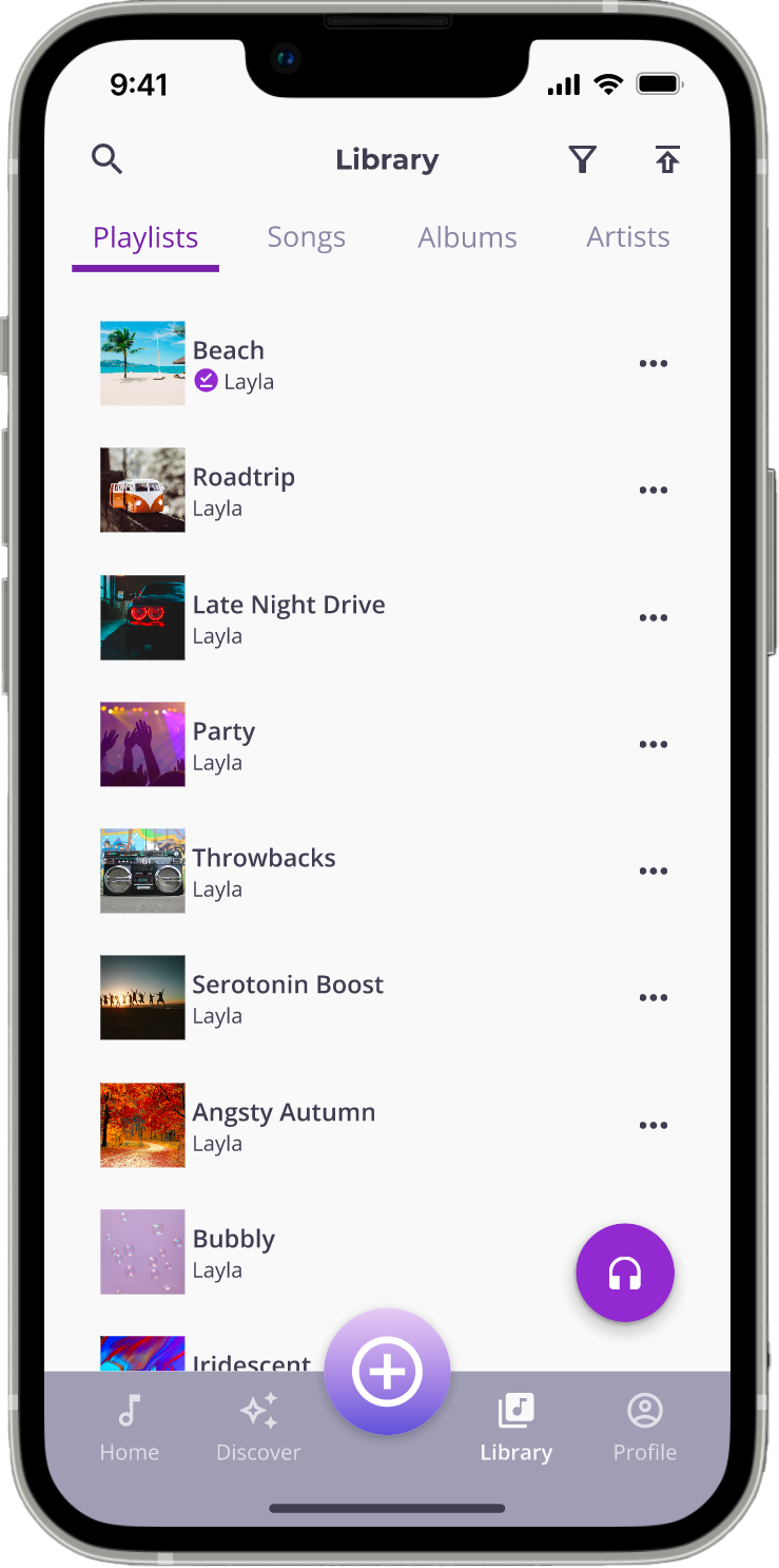
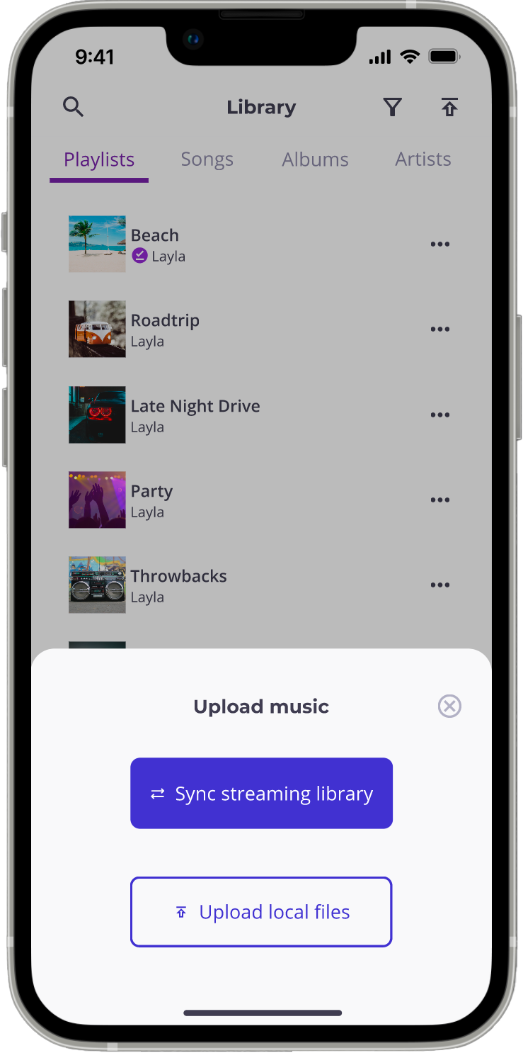
Users can upload all of their songs and playlists by syncing their current music streaming library with the app. This process tags the songs and playlists automatically, making it simple for users to start creating high-quality playlists and editing existing ones. Users can also upload local files to keep their entire music library in one place.
Social Features
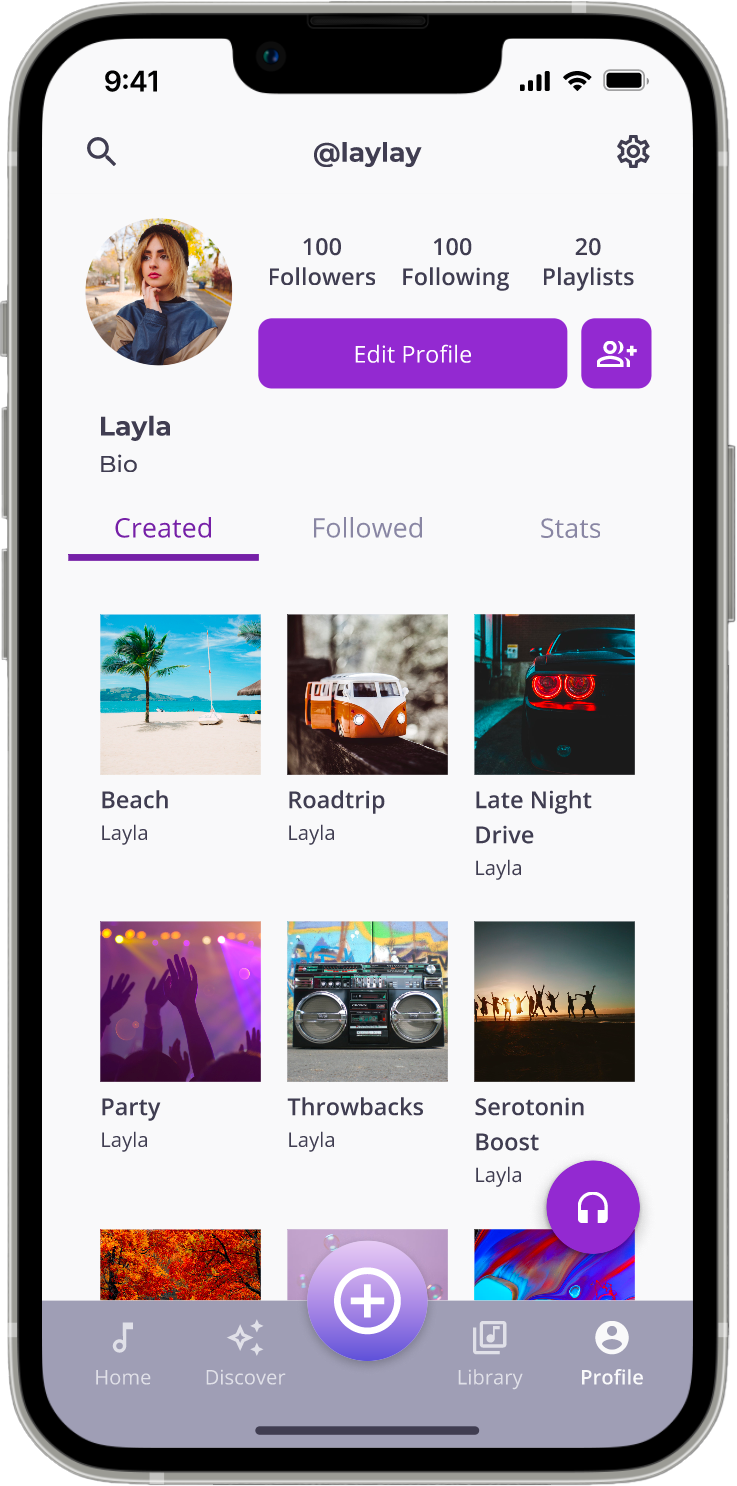
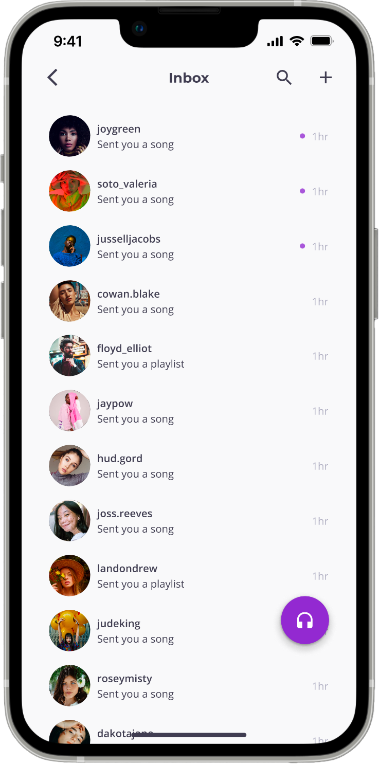
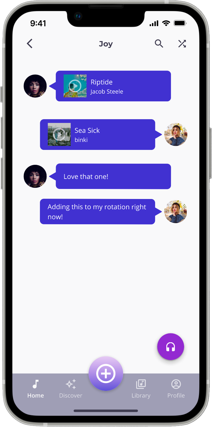
Every user has a public profile where their public playlists, as well as all public playlists they follow, are visible to other users. This allows users to connect with others who share their musical tastes and exchange music recommendations. To facilitate this exchange, I added a messaging feature that allows users to send music and playlists without using another platform.
The Community section of the app features playlists created by users, which replaces algorithm-curated playlists with playlists curated by humans. This gives users who prefer more control over what they look for the assurance that it will not be a random collection of songs thrown together by an algorithm.
