OVERVIEW
Background
For my second project with Google’s UX Design Certificate program, I tackled the Sharpen prompt, “Design an online ticket purchasing flow for a trendy movie theater.” Drawing on my responsive website design experience, I prioritized creating a seamless user experience for ticket buyers. Given the post-pandemic challenges faced by movie theaters, I was inspired to create a responsive website to streamline the ticket-purchasing process for all moviegoers.
Problem
The bulk of popular movie theater chain websites are not mobile-friendly and are not optimized to accommodate various ticket-purchasing decision styles. These factors, along with their annoying service fees, can discourage moviegoers, particularly occasional ones, from going to the movies.
Goal
Design a responsive website that makes buying movie tickets online more convenient than purchasing in person.
Timeline
January 2023 - March 2023
Role
Sole UX Designer
Responsibilities
User research, UX design, UI design, Usability testing
Tools
Figma, Useberry, Jira
UNPACKING THE DESIGN CHALLENGE
MARKET RESEARCH
Movie theaters are an experience
I began exploring my problem by conducting market research to understand the current state of the film and movie theater industry.
Insights:
• Movie theater revenue has declined due to the pandemic and studios offering direct-to-consumer content through streaming services with Premium Video On Demand.
• The primary reason why consumers have not paid to watch a PVoD movie is due to the cost.
• Reserved seating and comfort are crucial factors for online ticket buyers.
These insights revealed that the primary benefit users gain from going to the movies is not necessarily watching the movies themselves but the experience of seeing a movie in a setting that is not their home.
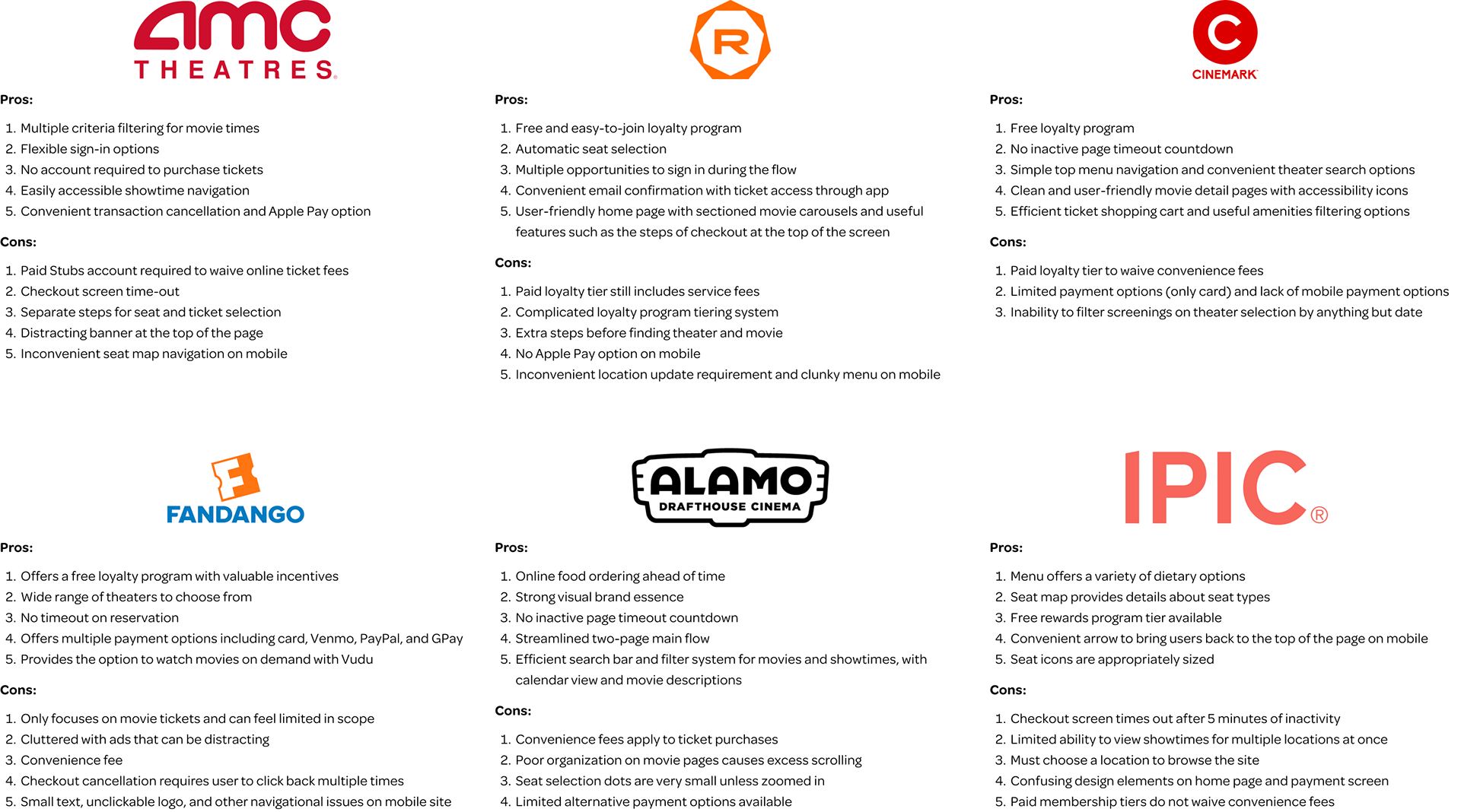
COMPETITOR ANALYSIS
Analyzing the competition
I examined the information architecture, website layout, and responsiveness of the websites of the top movie theater chains in the United States, as well as a few upscale theaters, to identify common features and opportunities to improve the ticket-purchasing experience.
UNDERSTANDING USERS
SURVEY
User insights for an improved movie-going experience
I sent a 15-question survey to 15 individuals who have all been to the movies at least once in the past year to understand their experiences purchasing movie tickets and going to the movies. From analyzing the survey data, I discovered how often a respondent went to the movies highly correlated with certain moviegoing behaviors and what they valued when making ticket-purchasing decisions.
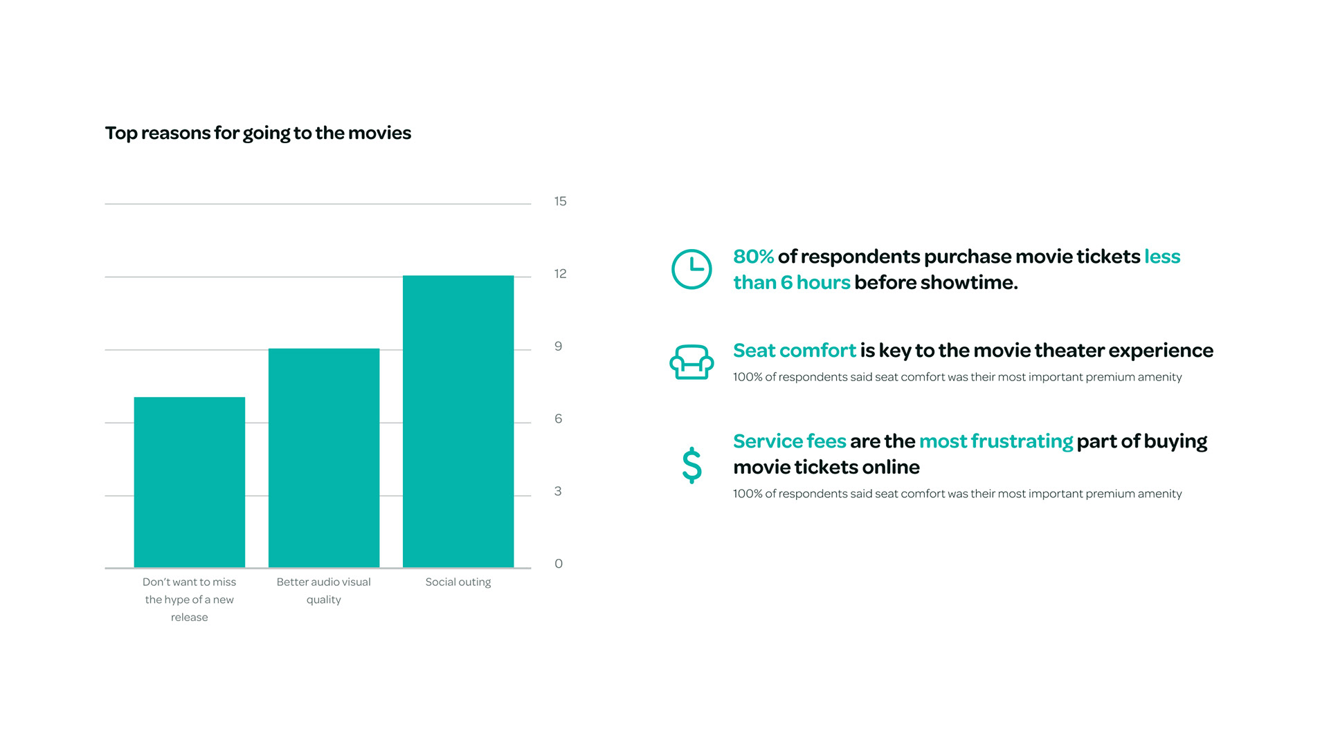
Insights found across all respondents
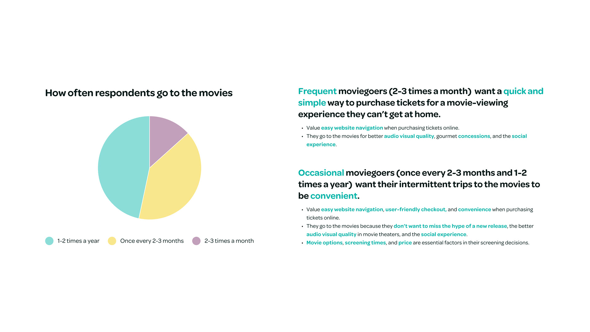
Insights based on how often respondents go to the movies
Since the majority of my users went to the movies either 1-2 times a year or once every 2-3 months, I based my user persona on those insights. This group interested me most because their views aligned with insights from my secondary research that it was important to emphasize the experience of seeing a movie in theaters.
USER PERSONA
The Social Moviegoer
Creating my user persona helped me empathize with my target user and better understand their pain points. I used the Social Moviegoer persona to frame my design challenge and guide my ideation session around solving these pain points to come up with targeted solutions that helped the users achieve their goals.
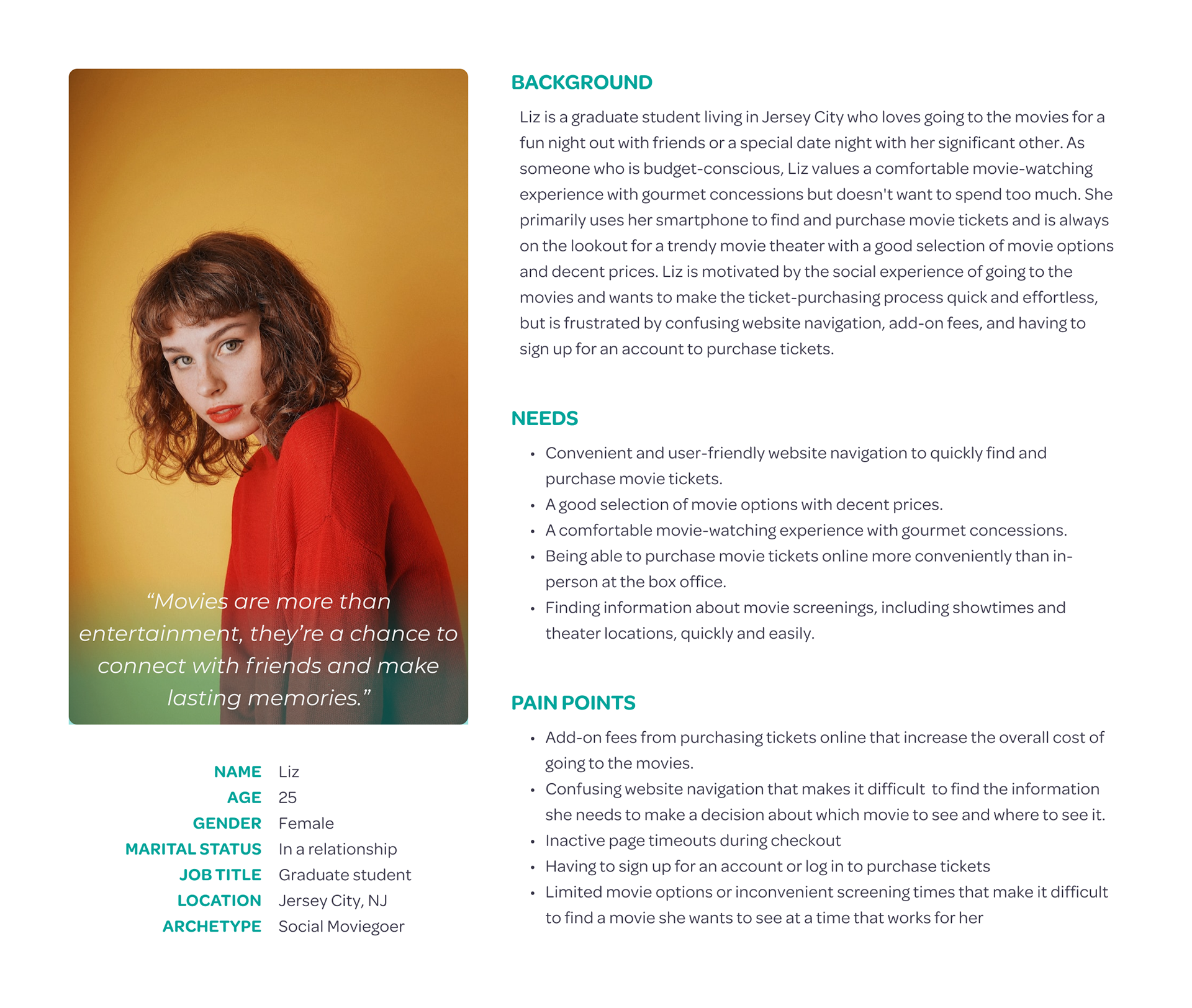
Liz is a social moviegoer who needs an effortless way to purchase affordable movie tickets online because she enjoys the social experience going to the movies provides.
POV Statements
• Users need to make going to the movies an experience with others because they go to the movies because it’s a social outing.
• Users need a way to effortlessly purchase movie tickets online because they are most satisfied with their experience when the website is easy to navigate and checkout is user-friendly.
• Users need to justify the cost of going to the movies more frequently because it’s costly and not as important as the social experience it provides.
• Users need a variety of movie options and screening times at affordable prices because these factors are most important to their purchasing decisions.
BRAINSTORMING
HOW MIGHT WE (HMW) QUESTIONS
Feature ideas driven by user needs
Based on my user persona, I determined the type of solution I needed to create would need to:
• Accommodate the needs of users who don’t frequent the movies often
• Make loyalty incentives worthwhile to increase the value of the theater experience
• Incorporate features that make it easier for people to go to the movies with others
• Make loyalty incentives worthwhile to increase the value of the theater experience
• Incorporate features that make it easier for people to go to the movies with others
Using the themes in my user persona, I came up with How Might We (HMW) questions for each Point of View (POV) statement to ensure my solution would address the user needs I wanted to focus on in my final design.
• How might we enhance the social aspect of going to the movies?
• How might we optimize the online movie ticket buying experience to incentivize online purchases?
• How might we encourage people to see movies in theaters more frequently?
• How might we streamline the movie selection process and present users with relevant screening options?
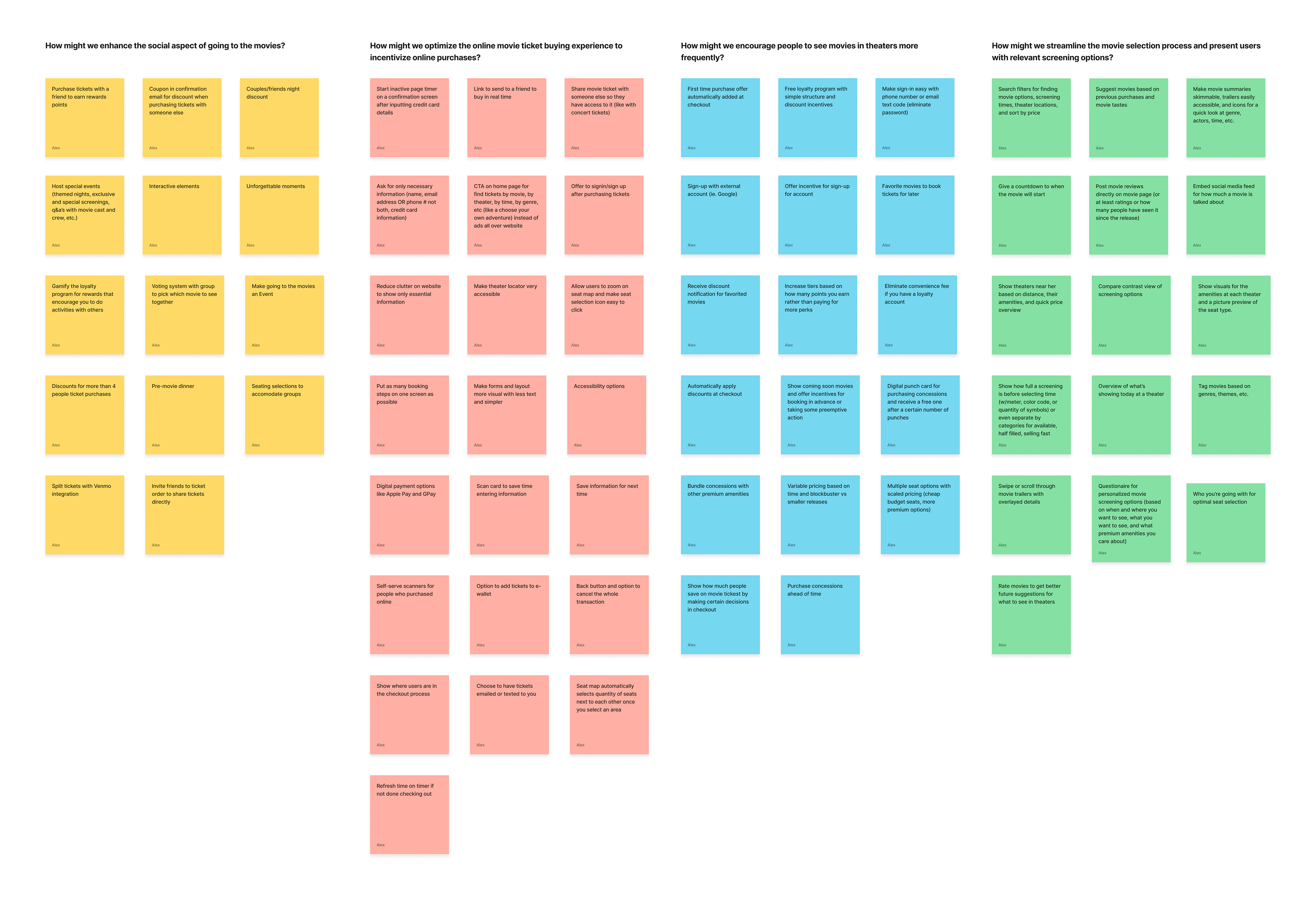
After choosing ideas that were most grounded in reality, I decided to prioritize three features I found aligned most with my user persona’s pain points and goals.
• Choose your own adventure style of picking movies on the home page using filters
• Eliminate convenience fees for people with loyalty accounts
• Compare and contrast views of screening options
• Eliminate convenience fees for people with loyalty accounts
• Compare and contrast views of screening options
USER FLOW
From initiation to ticket purchase
My goal with the main user flow was to map out the most efficient path for users to make decisions based on the information they knew and needed to narrow down in order to purchase tickets. This task can be broken down into users knowing or not knowing any combination of the following:
• WHAT movie do they want to see
• WHERE they want to see a movie
• WHEN they want to see a movie
• WHERE they want to see a movie
• WHEN they want to see a movie
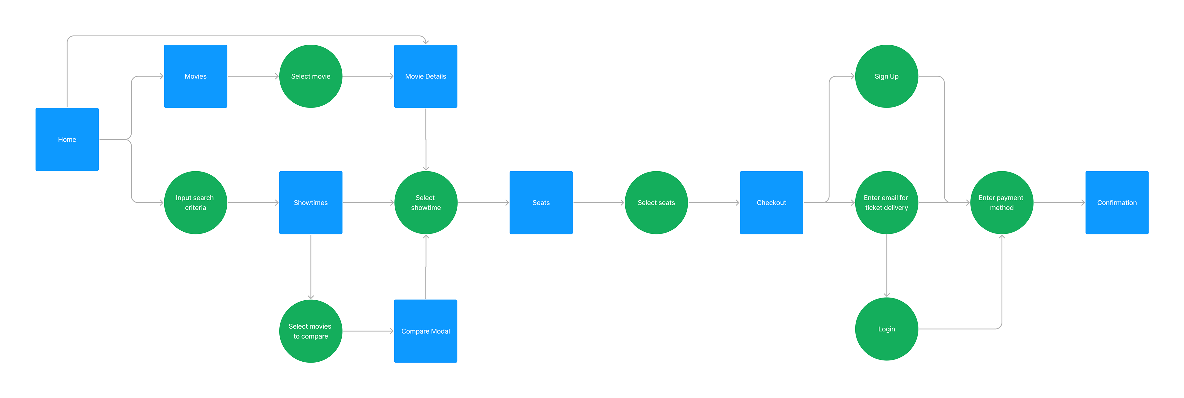
I saw how central the Home and Showtimes screens were to the flow because they were crucial to seamlessly connecting users to the Seat Selection screen. Organizing content on the Home screen would be a priority to ensure users could discover the information they needed to arrive at the Showtime or Seat Selection screen.
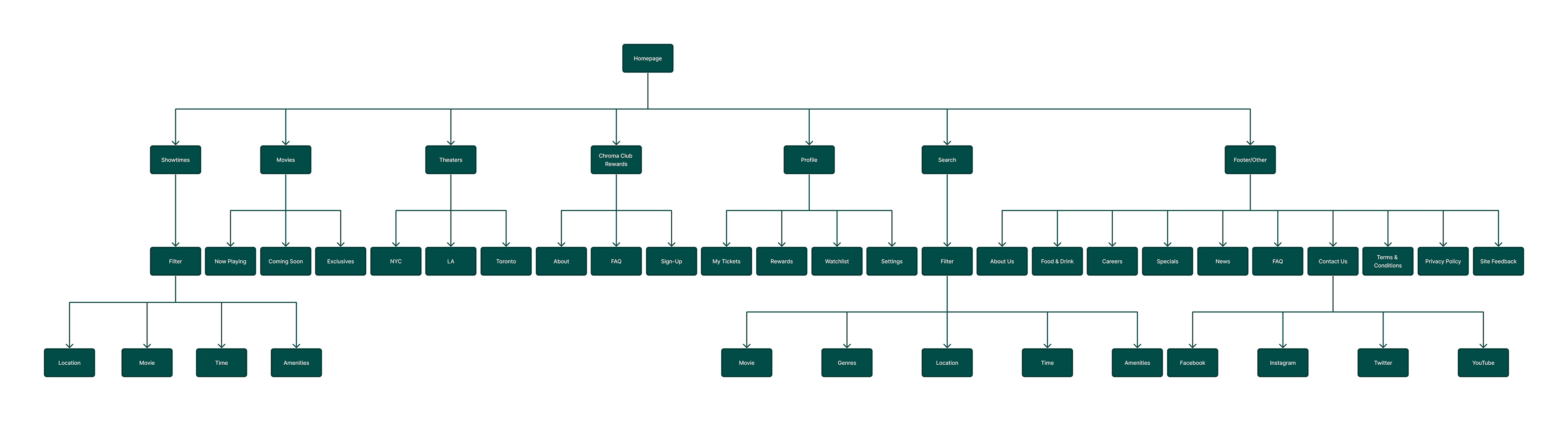
INFORMATION ARCHITECTURE
Organizing decision hierarchy
I compiled a list of features and content I wanted to include in my designs based on the screens in the user flow, organizing everything into their respective screens based on:
• The logical ways people would seek out the information needed to make screening decisions
• Common patterns used on competitors’ websites
• Common patterns used on competitors’ websites
WIREFRAMES
Sketching initial concepts
I sketched wireframes to quickly determine how my features would be displayed. My goal was to minimize clutter and include only relevant content on the Home screen to guide users in making screening decisions. The Home screen went through the most iterations because I wanted to come up with a layout that best presented the different starting points of the user flow.
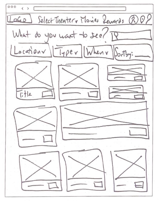
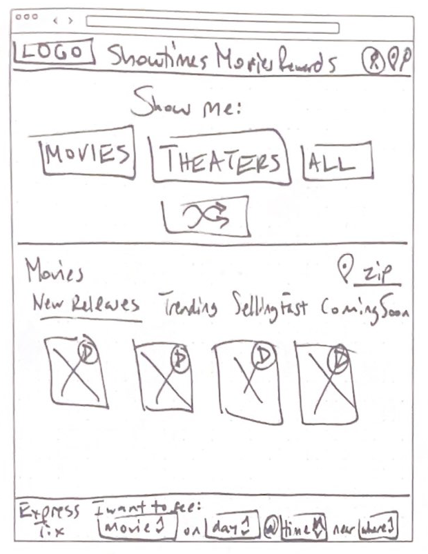
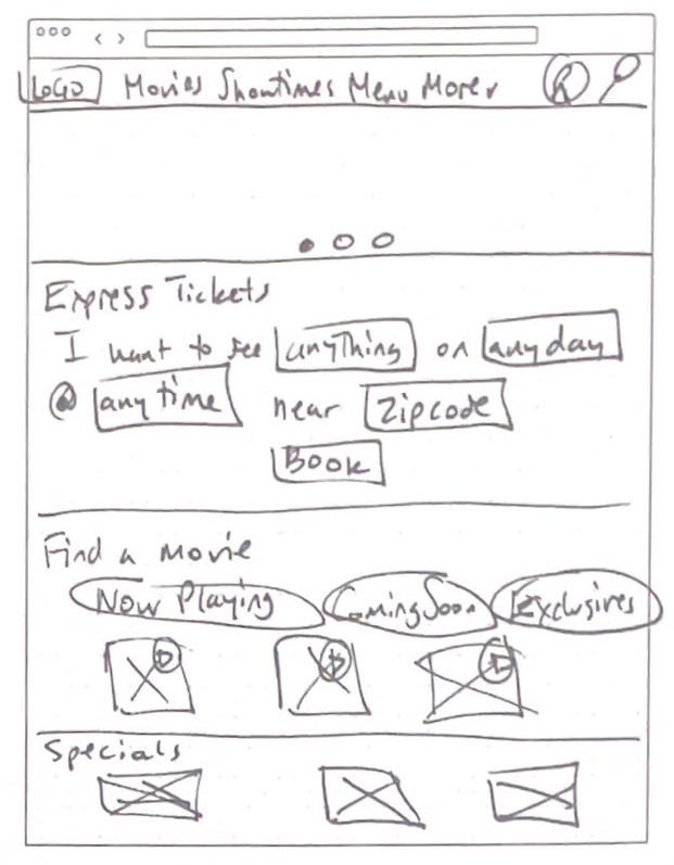
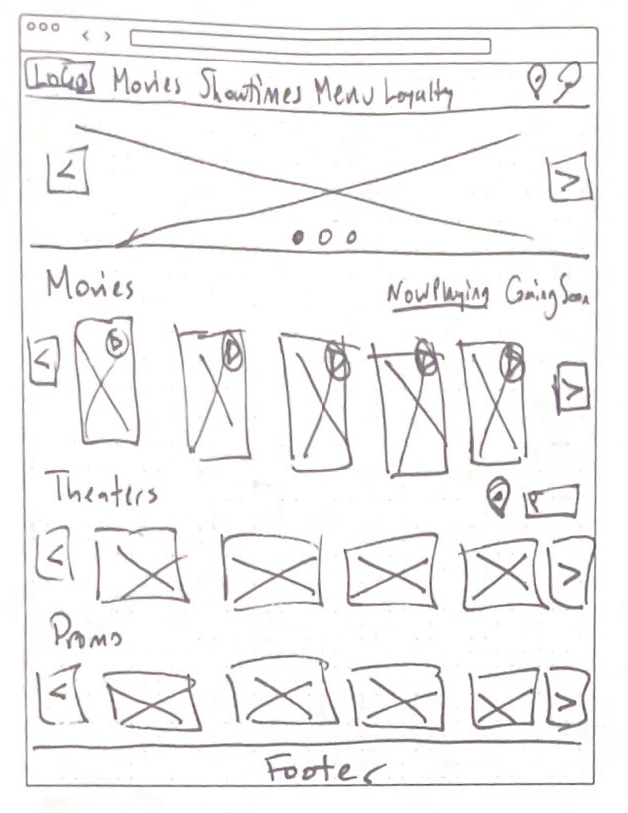
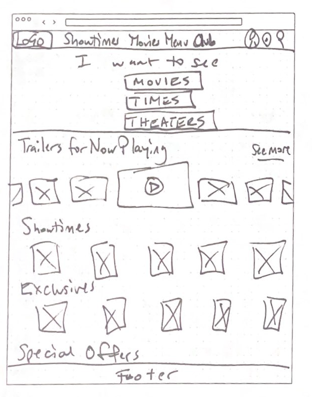
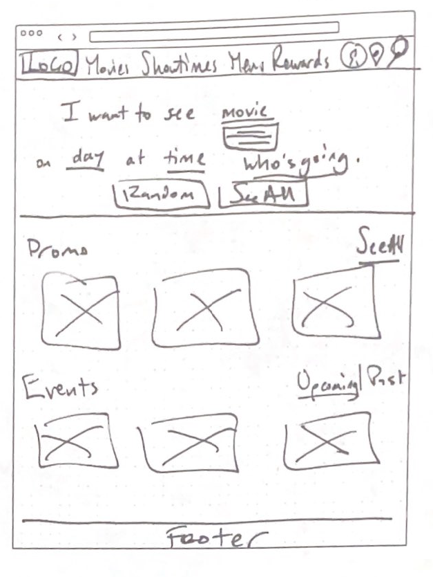
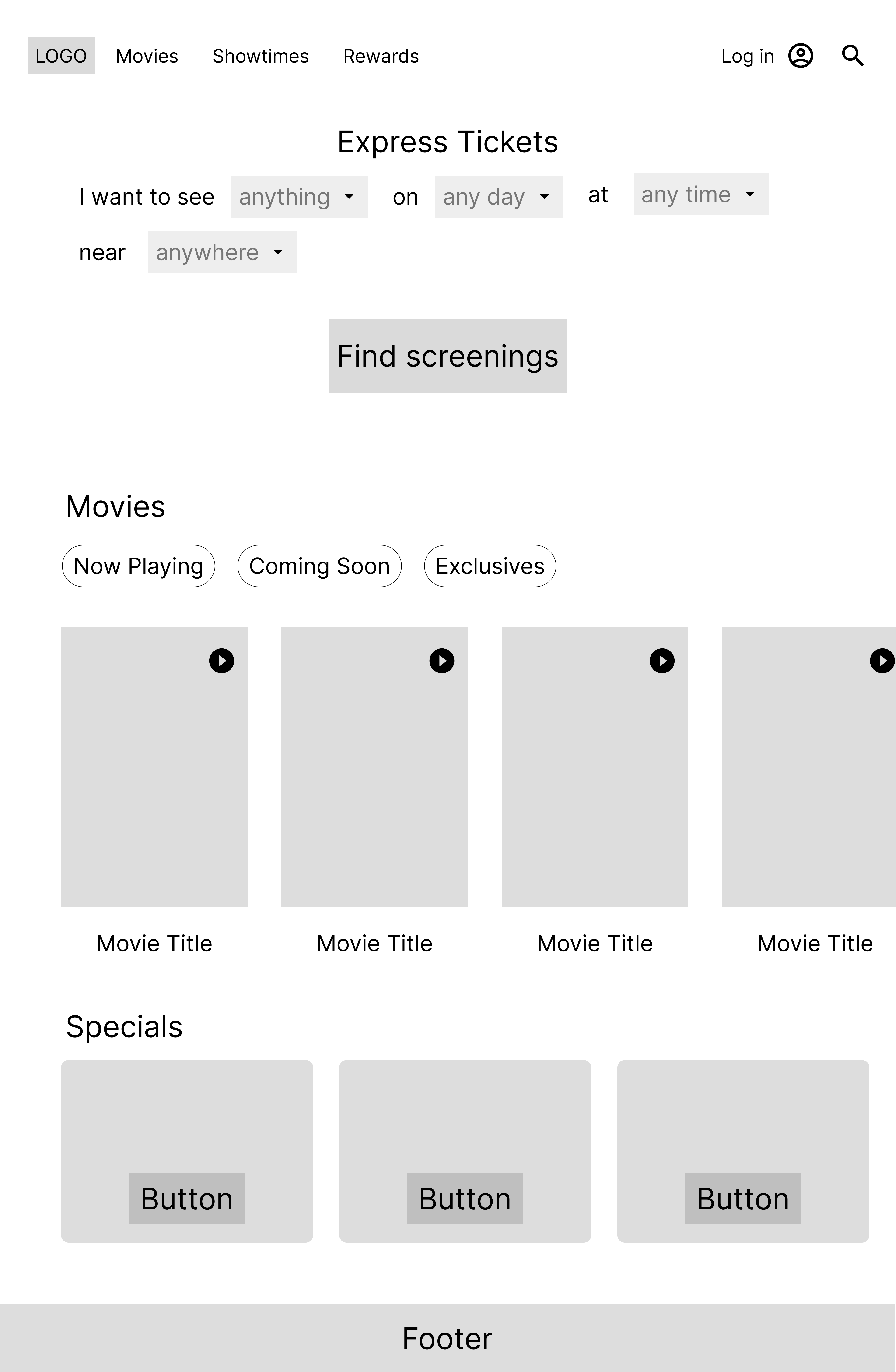
My focus with the Home screen was to give users a quick way to filter movie options. The last wireframe option was the most appropriate for my objective, allowing users to effortlessly input their search criteria. I kept the rest of the layout simple to allow for easy movie browsing before searching for showtimes and viewing current promotions.
The forgotten constraint created an unexpected twist
While digitizing my wireframes, I realized I did not create a version for my mobile layout and encountered challenges trying to scale my desktop layout seamlessly into a mobile version. To remedy this, I refined my desktop layout so certain elements could be scaled down for a mobile layout, such as the bottom bar throughout the checkout process.
TESTING
USABILITY TESTING
Evaluating high-fidelity designs
To evaluate the usability of my high-fidelity prototype, I conducted three unmoderated usability tests where users completed three core tasks:
1. Compare movie showtimes.
2. Purchase movie tickets using the desktop version of the website.
3. Access movie tickets using the mobile version of the website to scan at the theater.
I wanted to learn from the testing:
• Can users complete the core tasks within the movie theater website prototype?
• Are there parts of the purchasing flow where users get stuck?
• Are there more features that users would like to see included on the website?
• Do users think the website is easy or difficult to use?
• Do users understand how to use the Compare feature?
• Are there parts of the purchasing flow where users get stuck?
• Are there more features that users would like to see included on the website?
• Do users think the website is easy or difficult to use?
• Do users understand how to use the Compare feature?
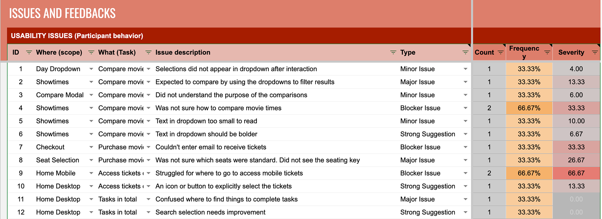
Uncovering usability issues
Using a spreadsheet to quantify how pressing the issues were, I determined the following were the most important issues I needed to solve:
• Struggled to locate where to go to access mobile tickets
• Were confused by the purpose of the compare feature and could not complete the task of comparing movie showtimes
• One user did not see the seating key and was not sure which type of seat they were selecting
• Were confused by the purpose of the compare feature and could not complete the task of comparing movie showtimes
• One user did not see the seating key and was not sure which type of seat they were selecting
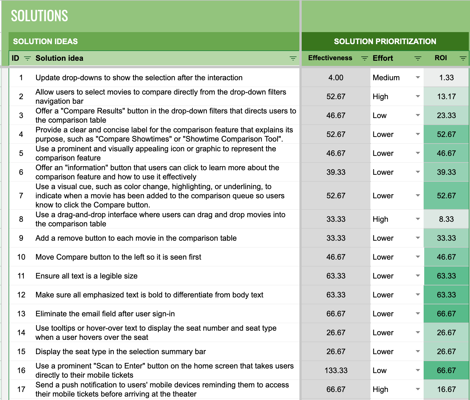
Data-driven solutions
I calculated the ROI of each solution I came up with that corresponded with an issue and prioritized the following solutions from high ROI to low ROI:
• Use a button on the Home screen that takes users directly to their mobile tickets.
• Use a visual cue to indicate when a movie has been added for comparison.
• Use tooltips to display the seat number and seat type when a user hovers over the seat on the seating chart
• Use a visual cue to indicate when a movie has been added for comparison.
• Use tooltips to display the seat number and seat type when a user hovers over the seat on the seating chart
OUTCOME
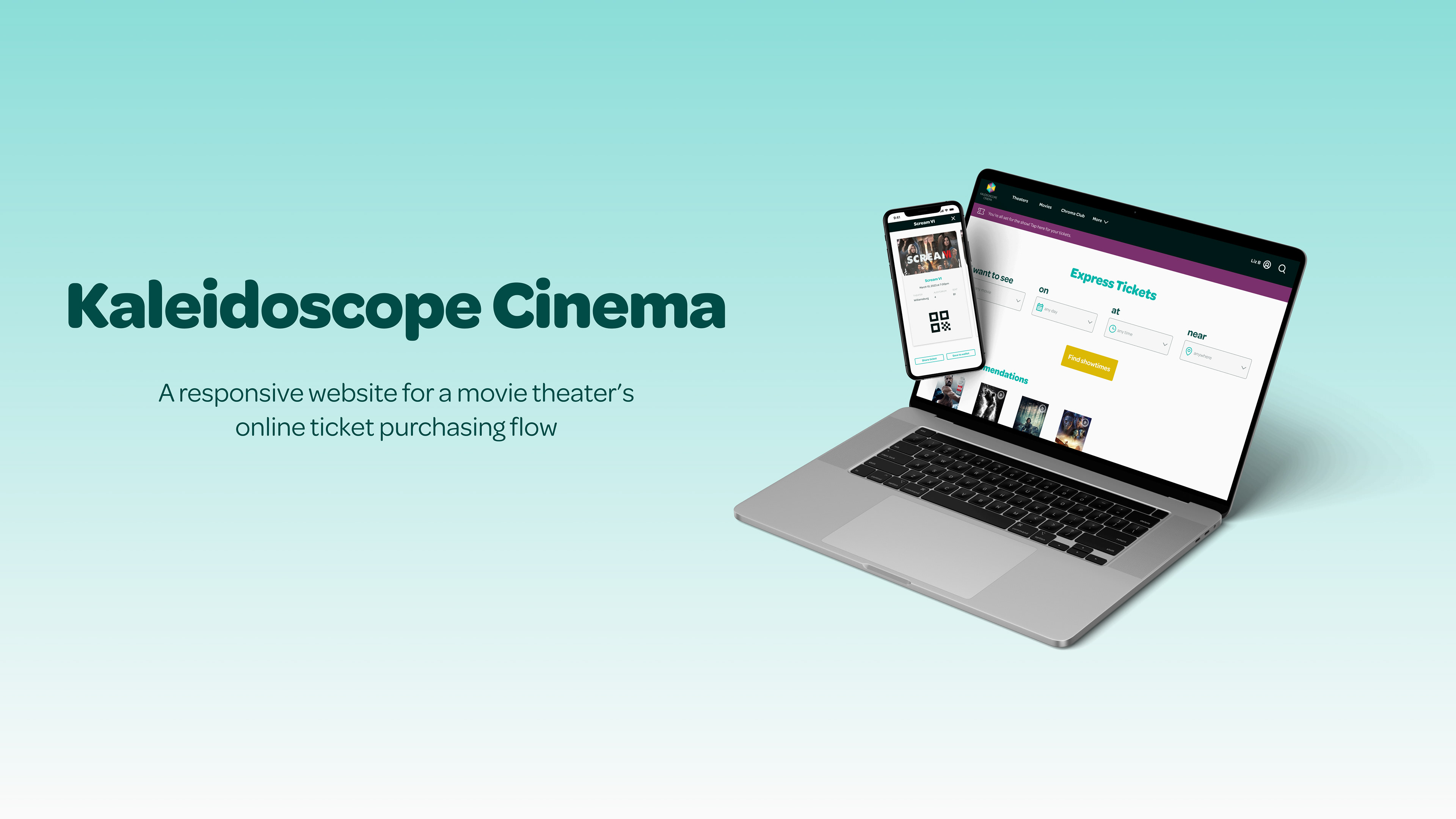
FINAL DESIGNS
A streamlined process for purchasing movie tickets
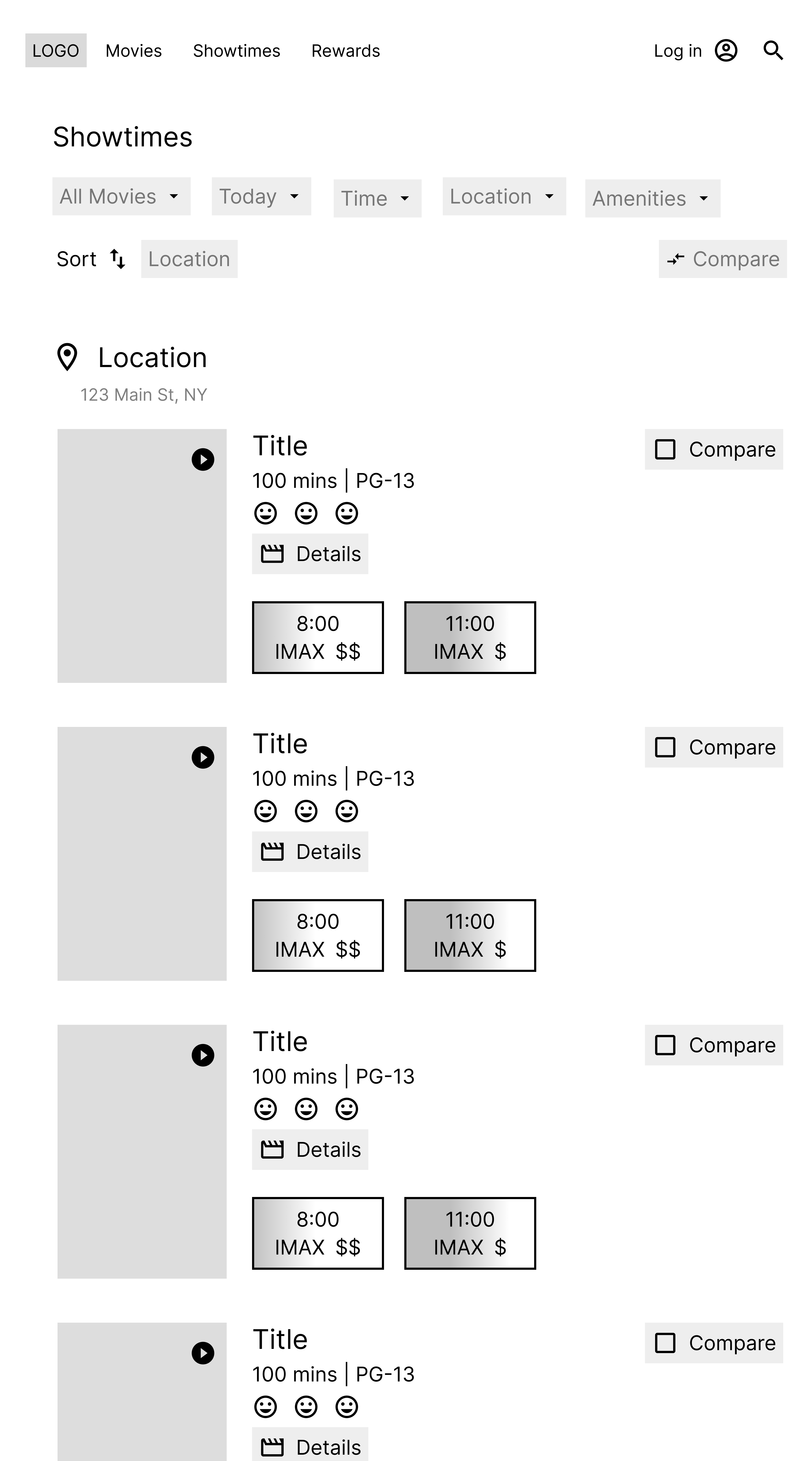
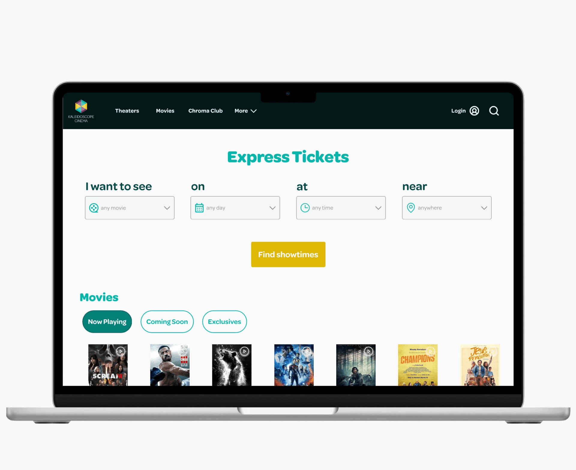
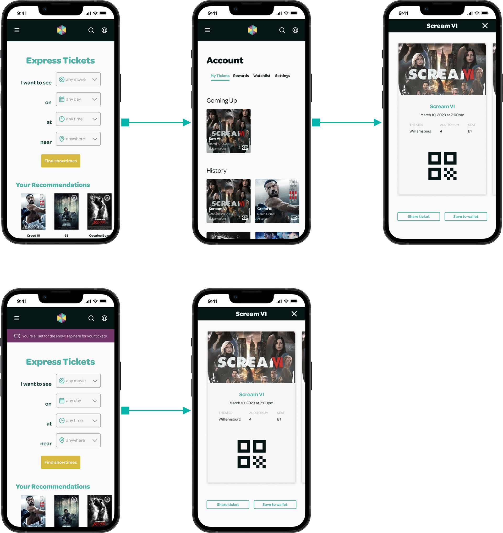
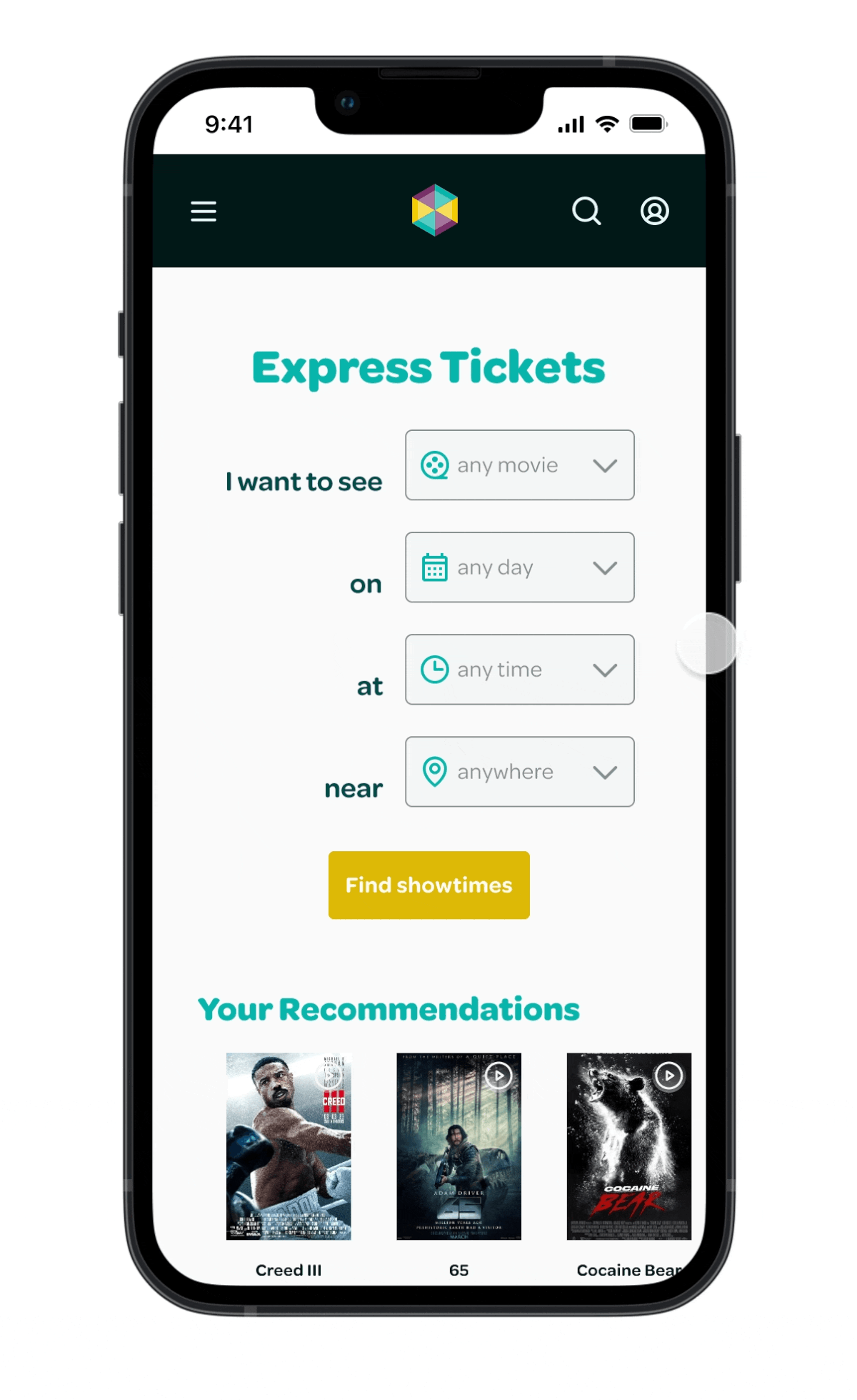
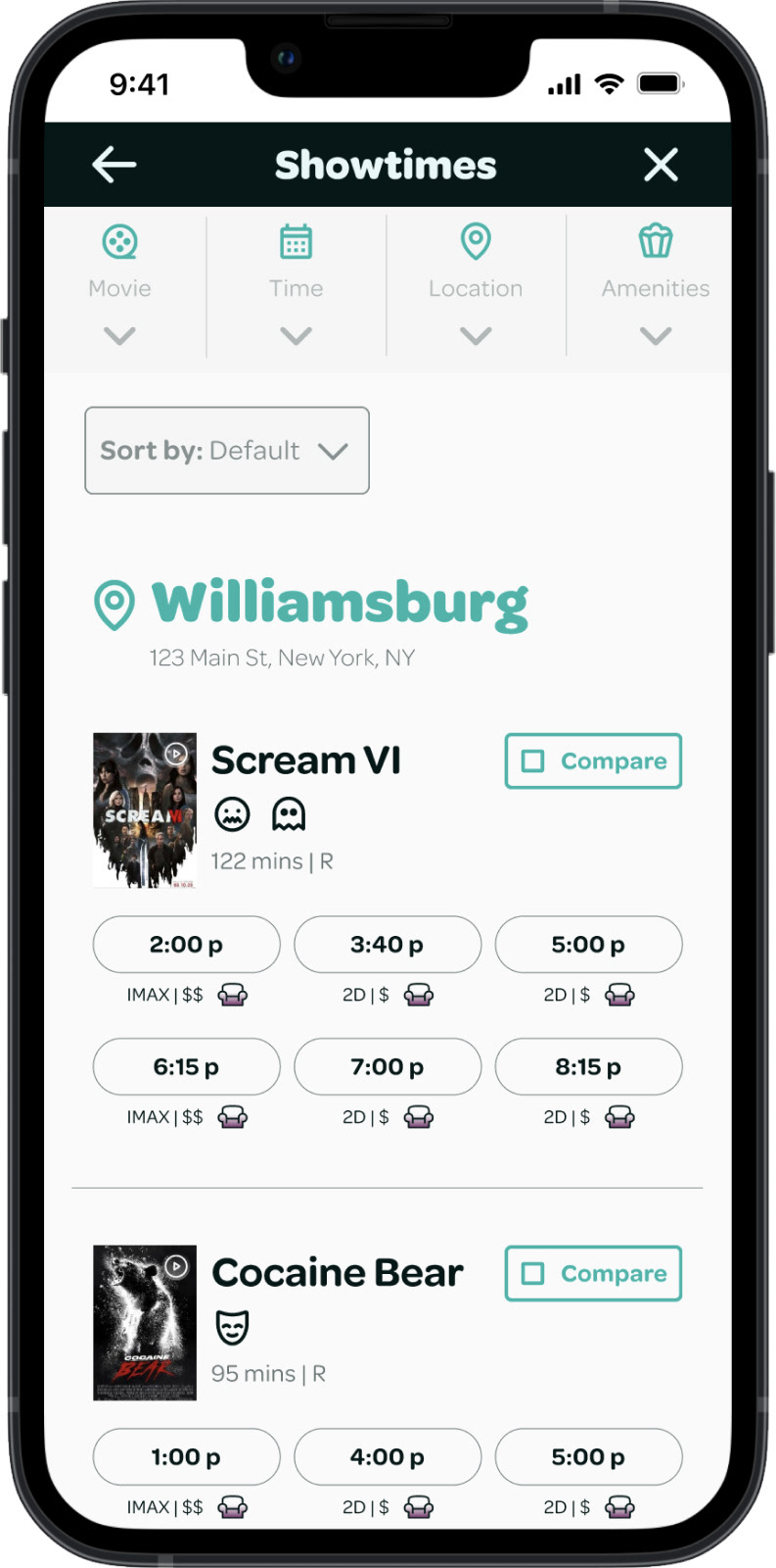
Express Tickets
Users can immediately start looking for movies on the Home screen using the Express Tickets feature, which allows users to see showtime options catered to what they're looking for.
Main user flow on desktop
Before and after usability testing designs for accessing digital tickets
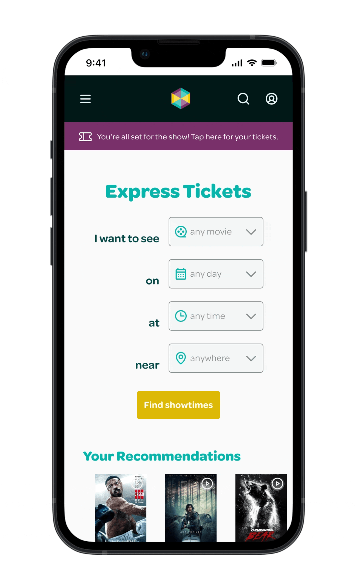
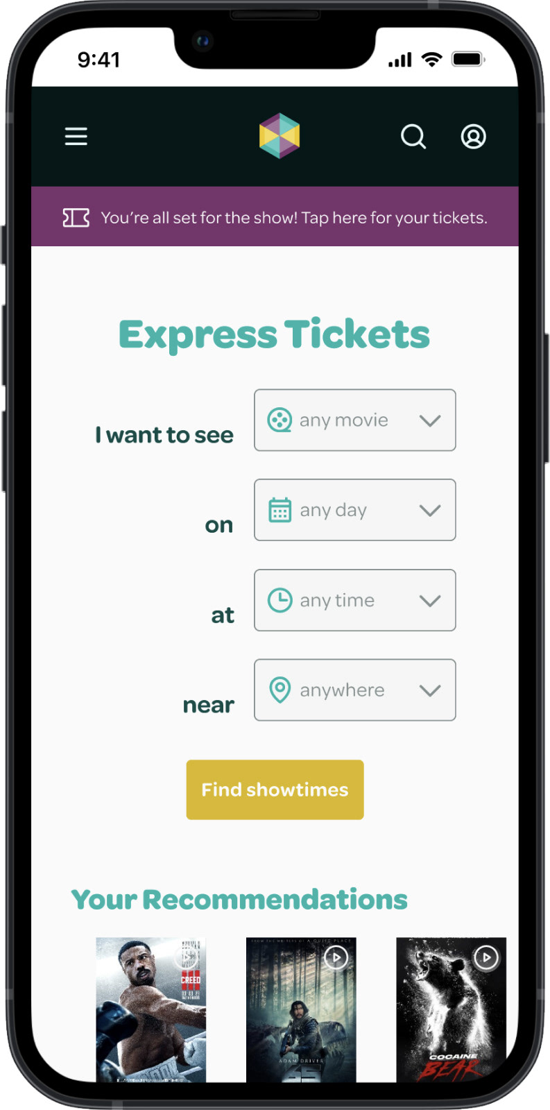
Accessing Mobile Tickets
Before usability testing, users could access their digital tickets by tapping the account icon in the top navigation. User feedback showed users were confused by the account icon and unable to complete the task.
To solve this issue, I added a sticky notification to the top of the Home screen that reminded users of their upcoming movie showtime and allowed them to access their tickets by tapping on the message.
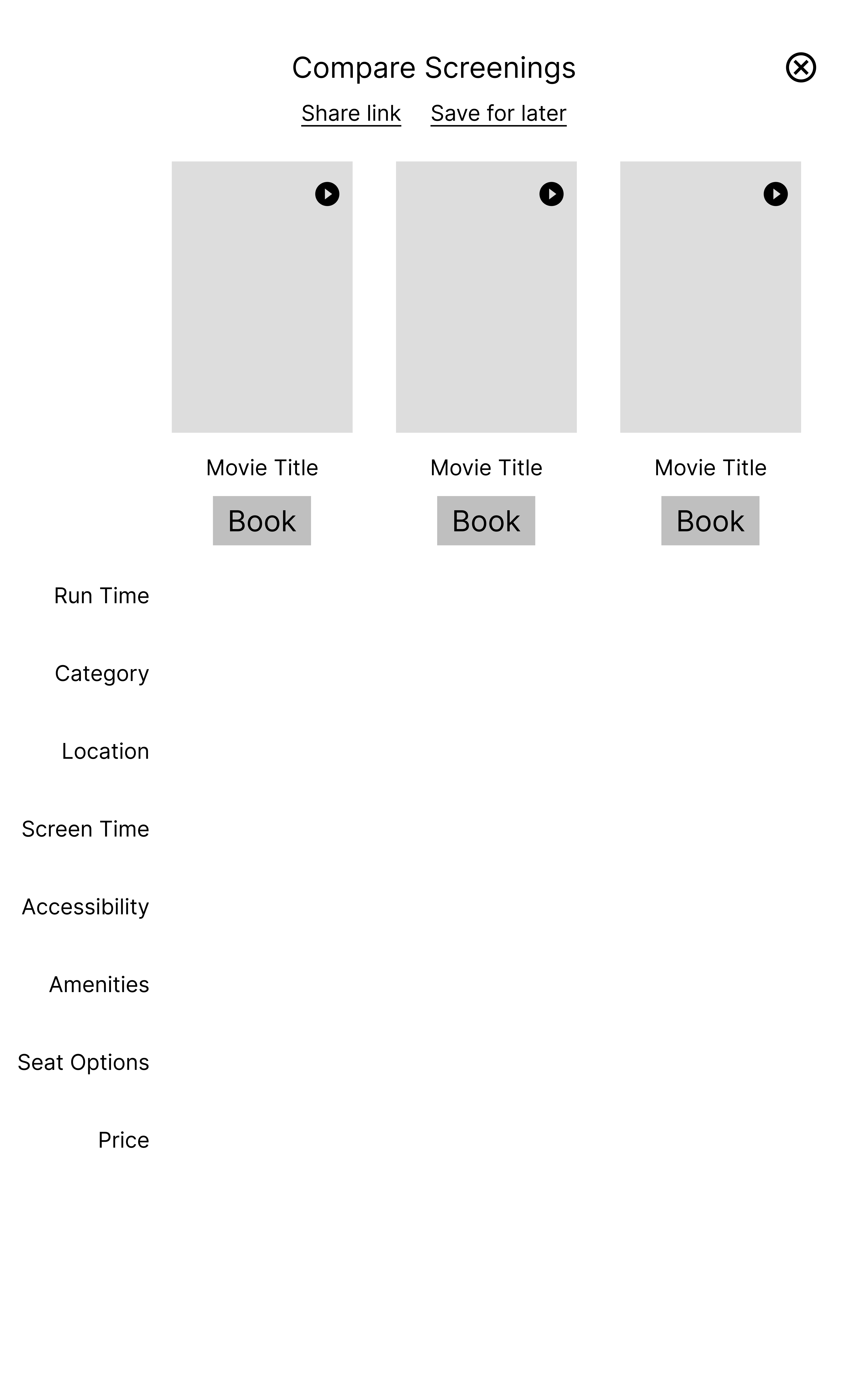
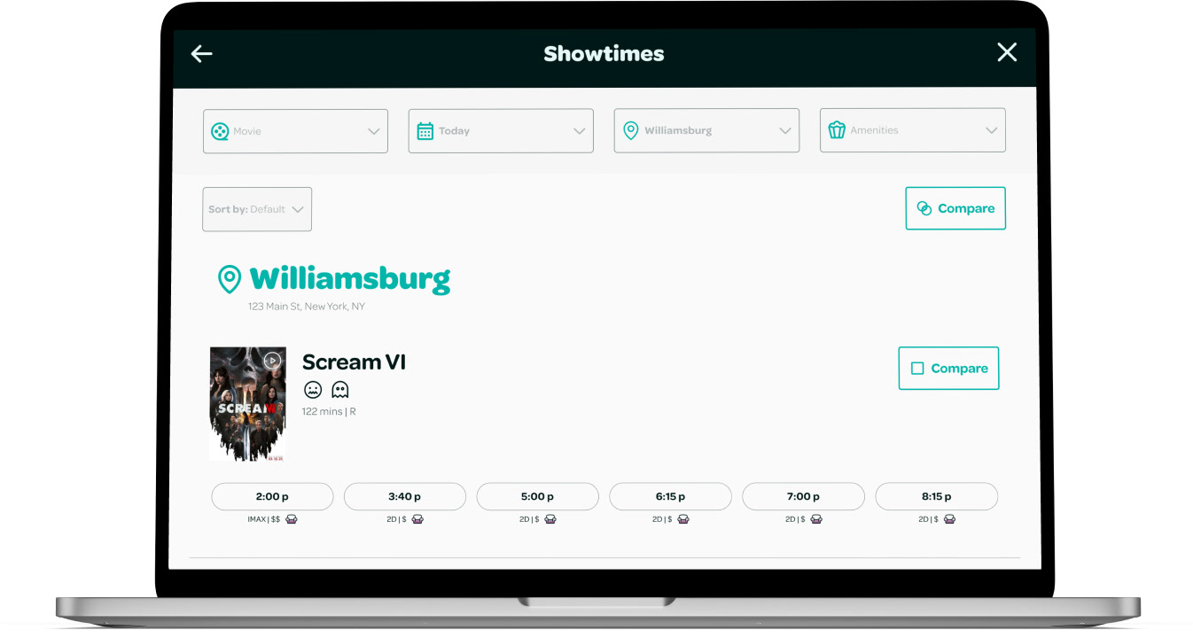
Compare Feature
In my first iteration, users could compare movie showtimes by selecting the movies they were interested in seeing and then clicking on the Compare button at the top of the screen. Usability testing revealed that users did not understand the purpose of the Compare Movies feature and were unsure how to proceed, preventing them from completing the task.
Compare feature before usability testing
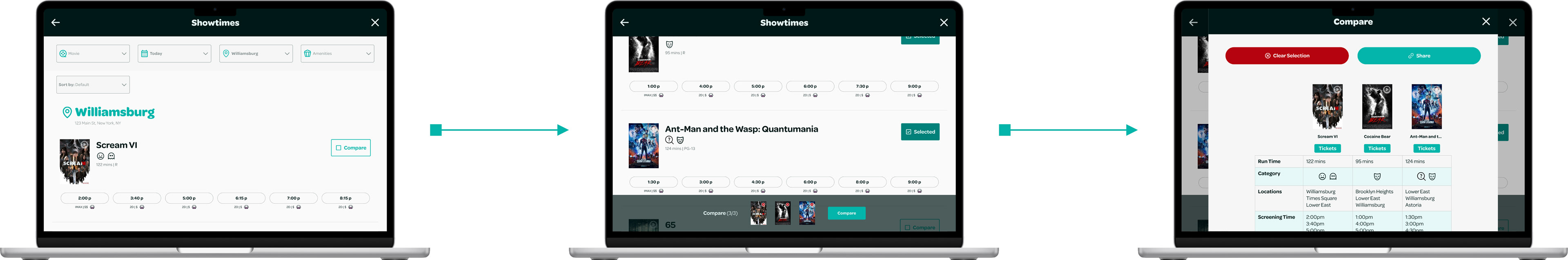
Compare feature after usability testing
I added a pop-up bar at the bottom of the screen to provide users with visual feedback after they select a movie. This bar shows the movies users have selected, allowing them to compare them side-by-side.
Users can also share the comparison table with others to get their input on which showtime to choose.
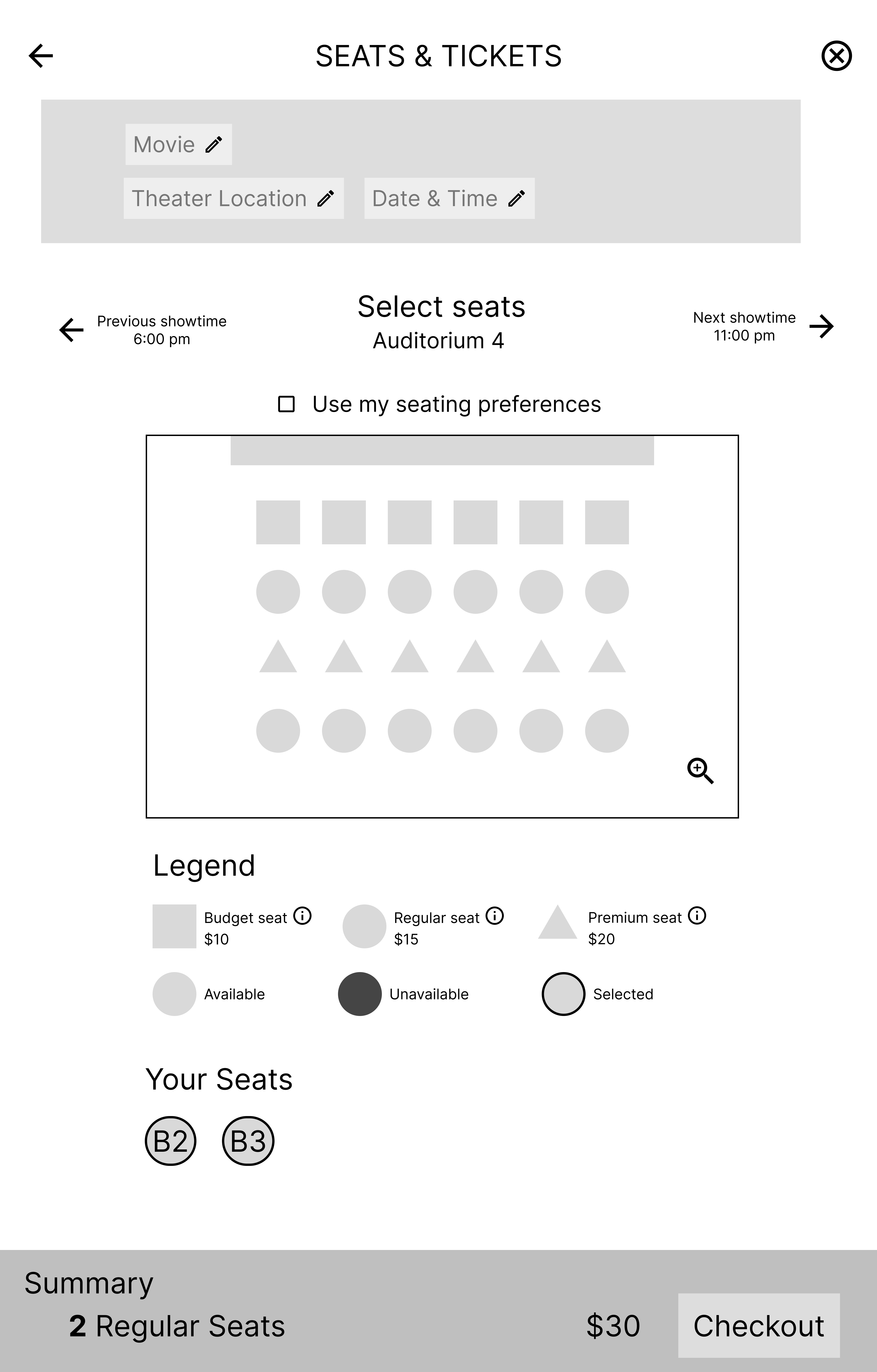
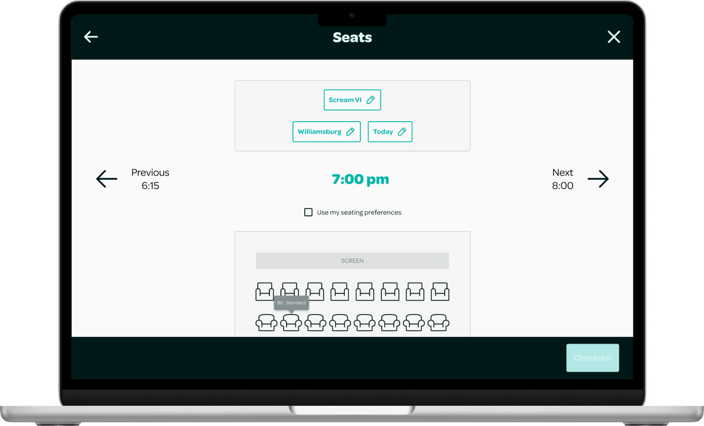
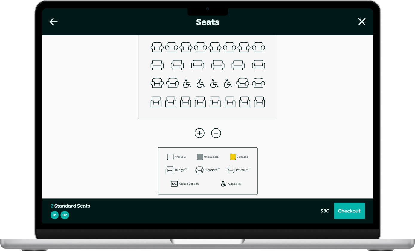
Seating Chart Key
Since my user research showed that users valued seat comfort as their top premium amenity, I created different types of seating to give users options based on the quality of experience they wanted and how much they were willing to spend.
Seating Hover
During usability testing, one user was confused about the type of seat they had selected because they did not see the key below the seating chart. I realized that others might encounter the same problem if their screen is too small to display the seating chart key. To address this, I decided to add tooltips that appear when users hover over the seats. These tooltips will show the seat number and seat type to prevent confusion.
Edit Order
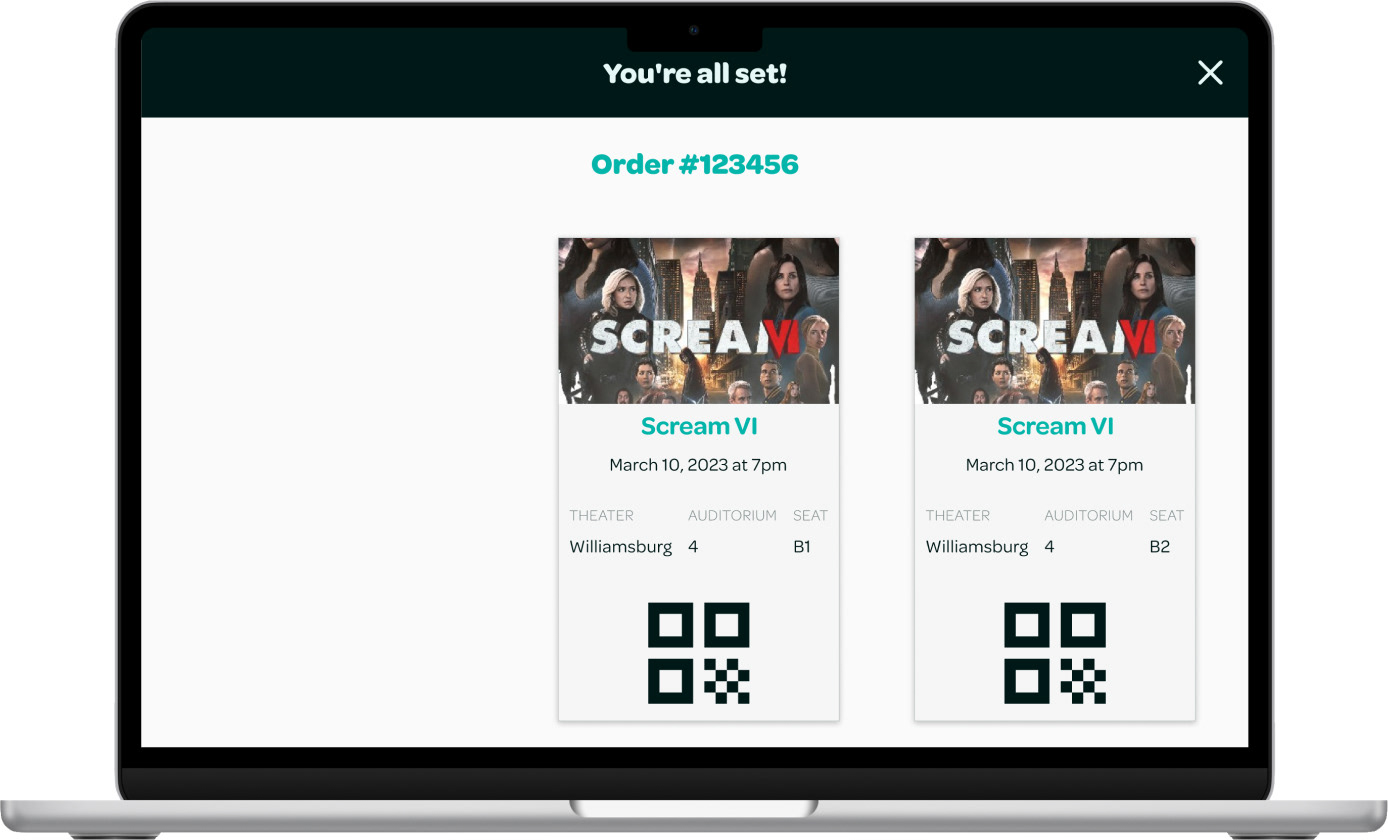
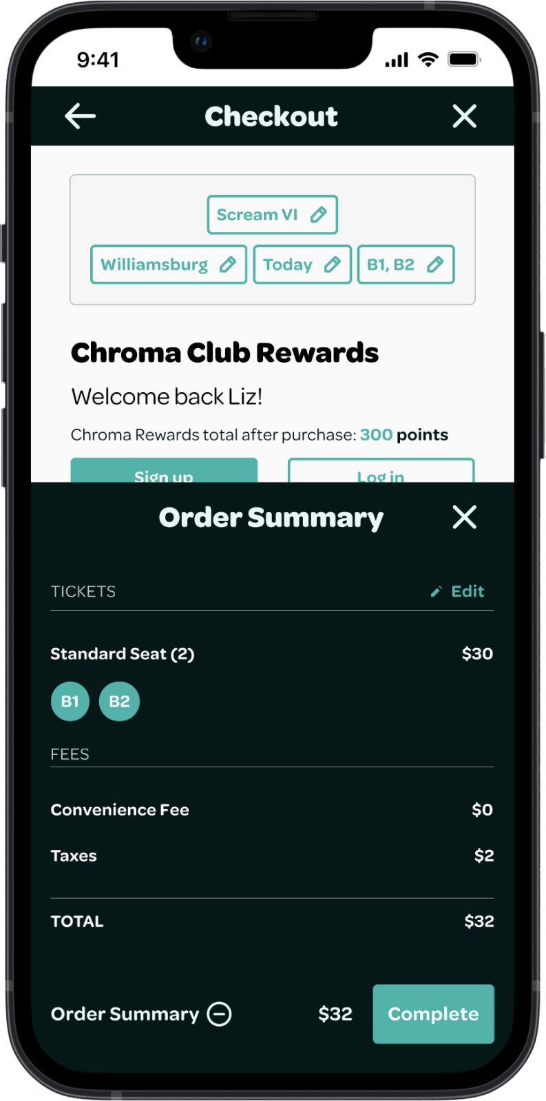
Users can edit any of their selections for their ticket purchase at any point in the flow using the edit box at the top of every screen without navigating away from the screen they are on.
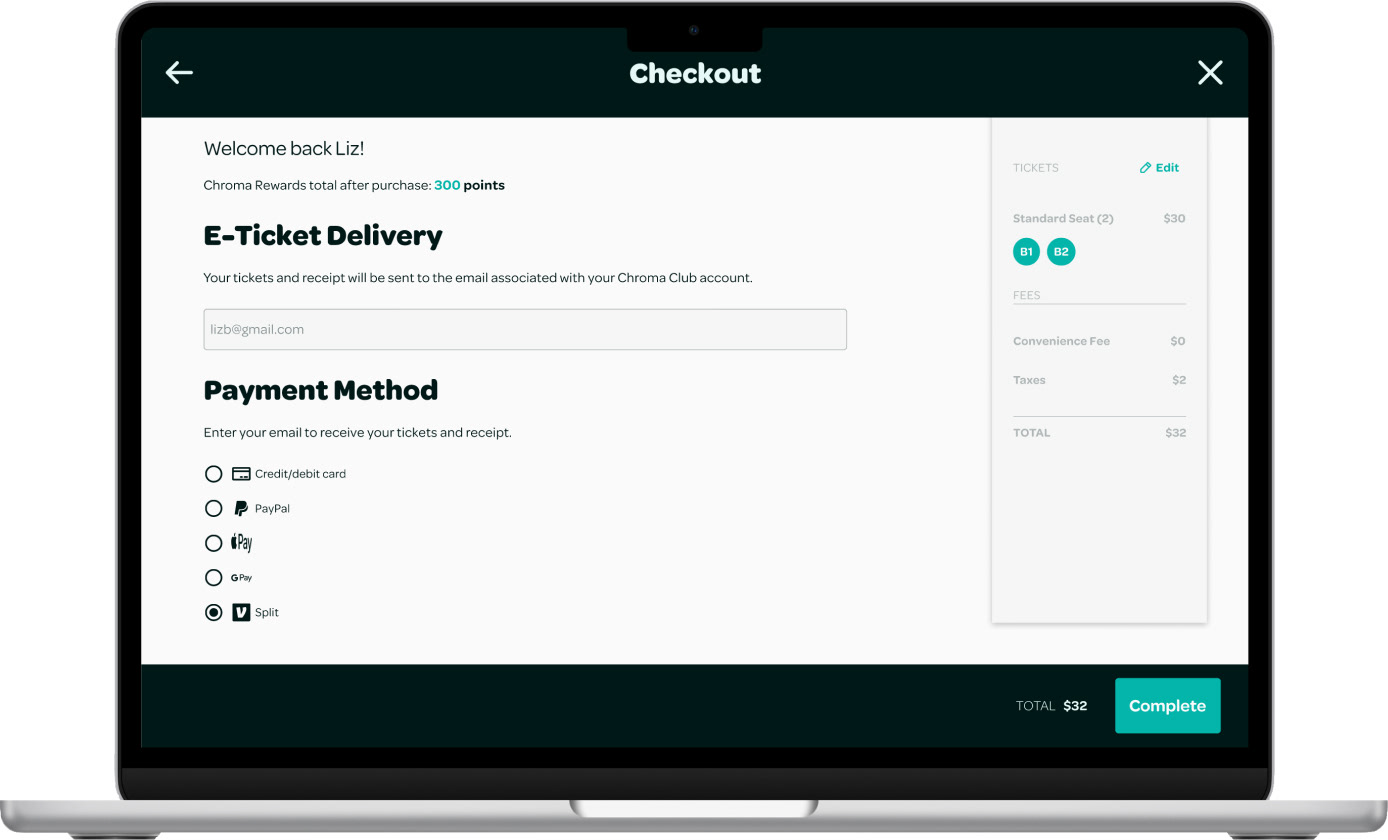
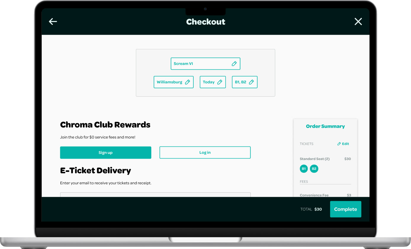
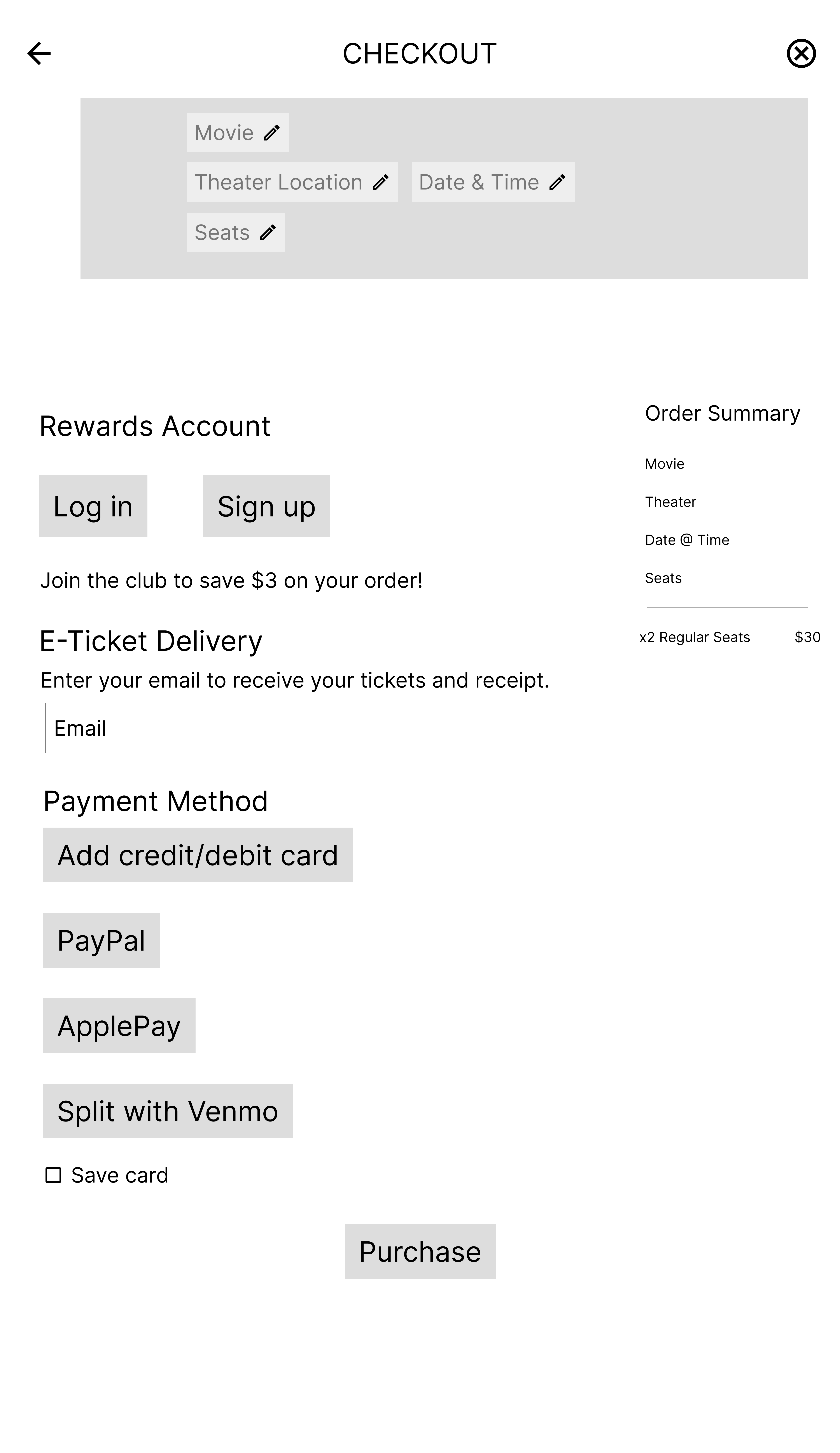
Waived Service Fees with Chroma Club Rewards
One common pain point for my target users was the additional fees added to their online orders. To address this, I created a free loyalty program that waives service fees for online ticket purchases. This program provides added value for users who don’t frequently go to the movies but still want to save money.
Split with Venmo
The option to split the ticket order via Venmo makes going to the movies with others seamless.
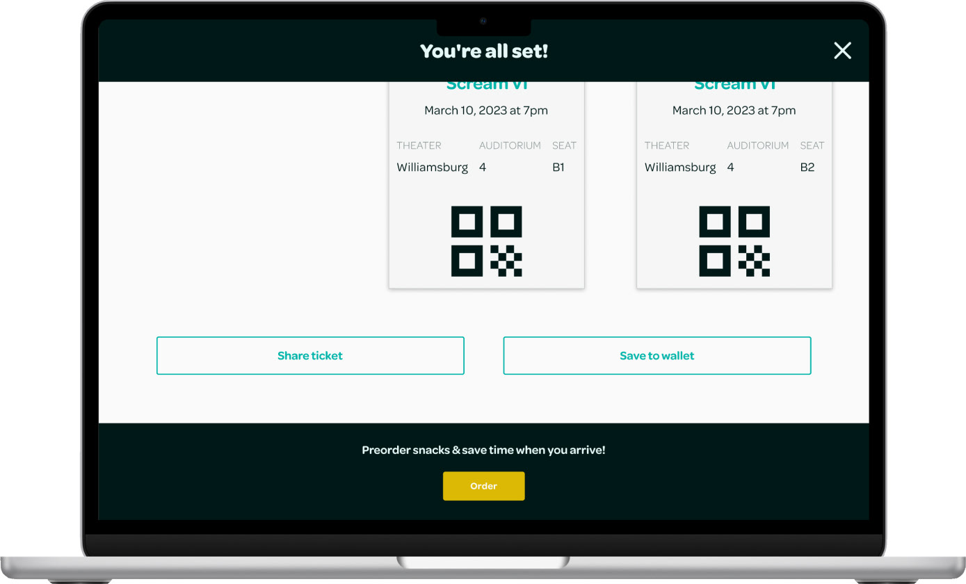
Sharing Tickets
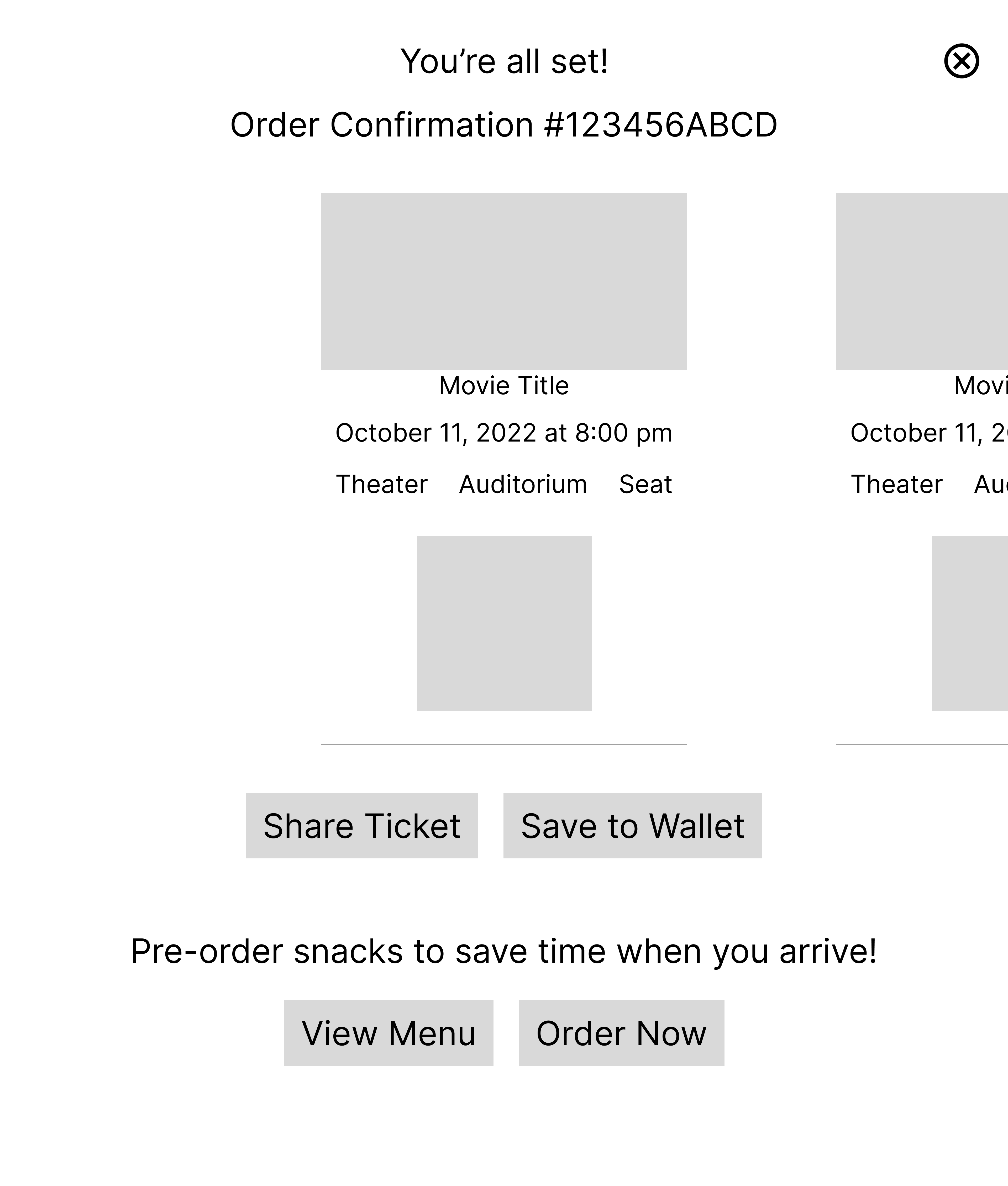
Users can send their tickets directly to whoever they’re going with or add tickets to their digital wallet.
Pre-order Concessions
According to my research, users care about concessions when considering what they value about the movie theater experience. To avoid disrupting the main task of purchasing movie tickets, I decided to include an option on the Confirmation screen for users who like to order their snacks ahead of time.
Responsive Elements
All elements were made responsive by adapting the size and function to be suitable for touch-screen use. I also designed these elements to take up as little space as possible and used expanding components whenever feasible.
Main user flow on mobile
Accessing tickets on mobile
Express Tickets feature adapted for mobile
Showtimes dropdown menu bar adapted for mobile
Order summary expands from bottom navigation bar
PERSONAL REFLECTION
Key takeaways
1. Mobile-first design
Initially, I developed my desktop wireframes first, which made creating my mobile screens difficult because I did not consider scaling the layout for mobile designs. To increase my design efficiency for future responsive projects, I plan to start with mobile design iterations to guarantee elements can be resized appropriately and provide the best user experience.
2. Usability testing earlier in the process
Conducting usability testing on my low-fidelity wireframes would have revealed critical design flaws earlier in my design process and improved my final designs. This approach would have also allowed me to test for more crucial features during usability testing on my high-fidelity prototype.
3. Work smarter, not harder
In previous projects where real content was essential for bringing designs to life, I manually entered all of the content. However, I realized this method was not scalable and looked for a more efficient solution to manage content to make my prototype more dynamic and engaging. I used the Google Sheets Sync Figma plugin for this project, which allowed me to add content to my designs from a spreadsheet, making the process smoother. In the future, I will continue investing time in researching plugins and other tools to expedite my design process.